Tuesday, December 27, 2011

zamo in the house!

Zamorano is currently having it's 4th annual student exhibit at the San Diego Art Institute, right in the heart of Balboa Park. The exhibit runs until january 14, 2012. Thirty-five student artists had work selected for this special exhibit.

The opening reception was on Friday, December 16, the evening of our last day of school before winter break. We had a great turn out for the reception. Twenty students and their families and friends celebrated their creativity and hard work. The student artists were recognized in front of the large crowd in attendance for the Institute's Winter C-Note exhibit.

It feels so good to be able to offer these real world exhibit opportunities to our fantastic student artists. It's really important for them to see their work outside of a school setting. The students seemed thrilled to have their work in Balboa Park and the family members and friends that came out to support them seemed like they really enjoyed the experience as well.

The following students were recognized further with Juror's Choice awards.

Alyssa Ortiz- kindergarten
Leban Yusef- 4th grade
Natalie DeLeon- 5th grade
Allison Robles- 5th grade


Keep up the great work kids!


Friday, December 16, 2011

all star artist

The boy all star artist for December is Samuel Gooden. He is a 1st grader in Mrs. Schmitt's and Ms. Willis's class. Samuel does a great job coming up with inventive takes on the projects that he does in art class. There is usually something about his projects that stand out. It could be his choice of color, composition, or the detail he adds. He also has great fine motor control for a guy his age. Samuel did numerous pieces in kindergarten that blew this teacher out of the water as well. I look forward to seeing him grow as a student and as an artist in future years.


I sat down with Samuel to get his take on a few things about art.

Why do you like to make art?
It's really nice to do. It makes me feel good.

Is there a art tool that you like most?
I like all of them, but I really like colored pencils.


Is there a place where you make your best art at? Places like your family room, the kitchen, or places at school?
In the classroom. I can see what my friends are doing and I can see how you are doing it.

What is your favorite thing to make or draw?
Battle scenes.

What do you want to be when you grow up?
An artist. An awesome artist.

I think you've got the awesome part already down, Samuel! Keep up the great work in art and your other school subjects. Thanks for taking your time to answer some questions.


This is part of a series of twice monthly posts that features the work and words of one of our many talented student artists at Zamorano Fine Arts Academy. To be selected, students must be models of respect, engagement, and creativity in the art room. A boy and a girl will be showcased each month.

Thursday, December 15, 2011

a little bling.

This week the 4th graders continued with their use of light and dark to make things appear 3d when they did a project inspired by the work of Matt W. Moore. It was a departure from the previous projects due to the abstract nature of Matt's work. I wanted them to explore zooming in and fragmenting a composition and still retain some sense of depth or volume.


Matt creates abstractions big and small that make great use of color and shape to create an interesting play between flat, decorative space and implied 3d space. Many of his pieces have gem or crystal like feel to them. While looking at work from his website, we talked about how parts of his images pop out at us, or go back in space. We identified his use of diagonals and tints and shades to create this sense of space. 


I compared this effect to how the cuts on a diamond create the create different values and bright spots due to how light hits it.

I used Matt's work to introduce the students to analogous color schemes and how these colors can create a strong sense of unity in art. They chose one of these analogous scheme to complete their project.

The art activity was pretty straightforward, but in these few steps were many possibilities for visual variety. 

1. Draw main shape
2. add diagonals, starting in center rotating to each corner, and repeating main shape outward
3. add analogous color pattern. Using tints and shades to create different values. 

One thing I found surprising was how many students, when asked to draw a line through the corner of a shape, drew through the shape's side instead. Even after having the class identify corners and non-corners on my large version on the projector screen. 


Thursday, December 8, 2011

charley's snow birds

I shared the work of Charley Harper with my 2nd graders this week. It's always cool to expose kids to his work. He is one of my favorite artists of all time. I love his take on nature and how he often modified it with geometric shapes.

I showed the classes a few images that Charley made and we agreed that his art work was not realistic. Things looked a little different. We identified some of the geometric shapes that he used in his illustrations. Continuing with our focus on shapes, I walked the kids through the concept of symmetry in art and nature. We identified this in a couple of his images and body and hand poses that I modeled for them.


The piece that we focused on for our project was the one below. It's about as "holiday" as I get in my instruction. We also talked about how the wings looked like they were moving because he repeated the wing lines numerous times.
I chose to approach this project as a collage. The hard edges and flat colors of the cut paper mimic Charley's use of shape and color pretty effectively. Before the students started cutting and gluing, we discussed how out approach to this drawing was going to be a lot different than the oil pastel drawings from the week before. I pointed out that working with oil pastels is great for bold, intense colors, but it can be tough to work with because it can get messy quickly. Collage on the other hand, is a pretty clean way of working, but depending on the colors of paper you have on hand, the colors may not be as intense.

Symmetry was reinforced with almost every step. For most parts, the students folded the paper first and then drew half of the necessary shape. When they opened the cut pieces up, I reminded them that the fold became their line of symmetry.

When it came to the leaves, students could choose whether they wanted to show symmetry or not.

Great job 2nd graders! Thanks again Charley for providing timeless inspiration for another project.


Thursday, December 1, 2011

blast off!

They're baaaccck.

The 5th graders that is:)
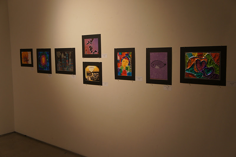
This week has been interesting because our ceramics instructor and photo instructor were pulling students out while the classes were working with me. So instead of 34 students, I was working with 22. I'm always sad not to be able to share a lesson with all the kids, but it is a treat to have the smaller classes sometimes.

This week I introduced them to the work of Danny Haas. He is a designer that may have a bigger love of Star Wars than I do. Maybe.

That aside, Danny makes some sharp looking images. Some are realistic while others a worked in a more figurative way. I also like his consistent use of monochromatic and analogous color schemes.

We looked at a number of his pieces and discussed the differences in style between them. We also got into how Danny creates a sense of depth even when the images are more figurative through overlapping, size change, color value change.


The image that inspired the project was actually not a Star Wars related design. I first found the image below and thought it would make an interesting collage project. I also like the combination of flat shape and simple patterns to create variety in color value.

We also discussed how the shape of the thruster smoke reinforced a sense of motion in the design.


We did a lot of cutting for this project, but most of the shapes were fairly simple for the kids to execute.
When they were drawing and cutting the cloud shapes I emphasized the need for a range of sizes, big to small, so that they would help define the depth in their collage.

After getting most of the shapes cut and glued in position, the students used construction paper crayons to add patterns to a couple areas. The rocket and smoke were made at the end. 

Even though the students were following the same steps and drawing the same elements, I was pleased with the overall variety of scenes that were made. Kudos to the big kids on campus!

For display purposes, each class used a slightly different color scheme.