Thursday, March 29, 2012

some serious waves

One more day until spring break! Looking forward to a month of no to school so I can go camping, hopefully do another mural, plan some lessons, and take some time to just chill.

20 minutes less with each 5th grade class this week due to parent conferences.

How about we draw some big waves to get in gear for spring break and some possible beach time. I have admired the work of Robert Longo for years. His choice of subject, his technical skill, and the size of his work all draw me in and keep me looking.

A few years back he did a series of large charcoal drawings called Monsters. Each drawing is of a seriously ferocious looking wave. Longo works from personal photos as well as photos from surf magazines and other resources. He doesn't merely copy a photo, he combines them and creates something new.


For the purpose of our short time together, the 5th graders recreated one of Longo's drawings on a smaller scale. One of the 5th grade standards is recognizing abstract, representational, and realistic styles in art. They had already created projects along the more abstract side, so Longo's work is a great  contrast to those. The students did an eye drawing last week that had some realistic qualities in terms of value and some abstract qualities in terms of shape. This exercise kept the ball rolling towards creating realistic art.

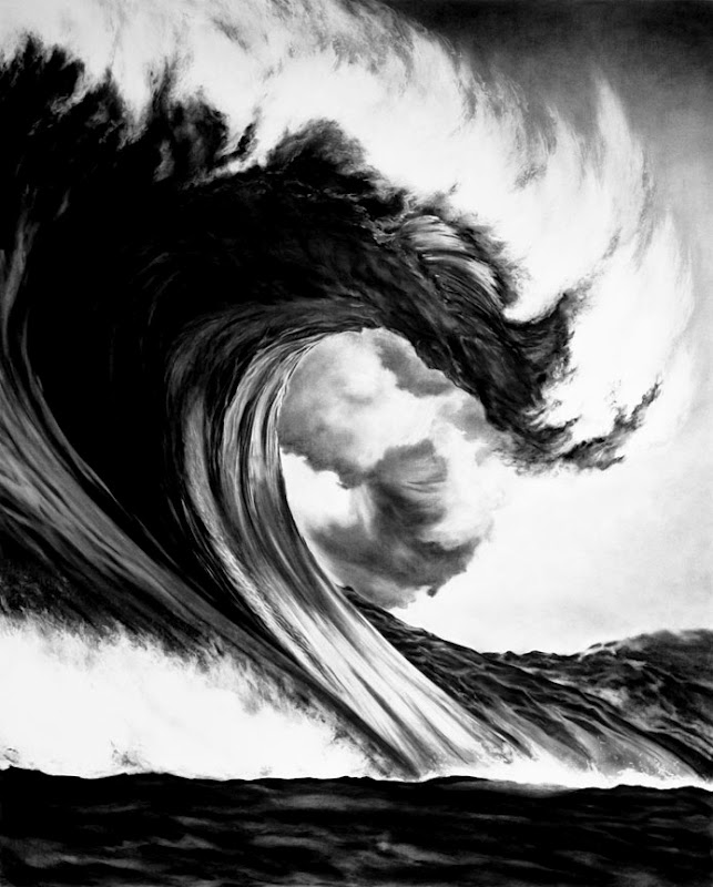
The students agreed that what made Longo's work so realistic was his attention to detail in value, shape, and texture.

We drew out a basic contour sketch that located major shapes and value shifts first. I emphasized that this makes drawing more complex things easier. Then we added value to the darkest areas in the drawing using a ballpoint pen. Pencil shading and adding more detail to edges occurred next. Students tried to add value to areas while using a pen or pencil stroke that was consistent to the curve of the wave. They added line and shape patterns to make certain ares look reflective, bumpy, and misty.

Students made their drawings on 6x9" sheets of paper, which worked out well for the time frame and for the pen work. Again. like the eye project before it, many students were hesitant at first, but once they applied themselves many students exceeded their expectations and created drawings with a good sense of volume, and variety in texture and value.

When I see them after our break I plan on giving them more freedom in subject while still addressing realistic style in their work.


Tuesday, March 27, 2012

40 minutes? bring it!

For the rest of this week, including today, our school is on minimum day schedule due to parent conferences. I modified my schedule for the week, so that I could still meet with all the classes each day and the classroom teachers all get a breather. This leaves me with 40 minutes instead of the normal hour to do a lesson with the kiddos.

I still wanted to do a project focusing on warm and cool colors using an image by Geninne Zlatkis for inspiration, but I knew the bear and bird project could not be completed in that time frame.

I selected another, well, part of another image she made, for the students to model their drawings on. We still focused on the same elements- warm and cool colors, creating volume with color value, and pattern/texture making.

Blue Opuntia

She included a close up of the image on her blog and I decided that section would be more manageable for the students to do.


Instead of breaking out the white paint at the end to add texture and pattern, students used a superfine sharpie marker to add cactus spikes and feather patterns to their drawings.

The students are really starting to get the hang of making things look 3d by pressing hard and soft to make different values. This will be their last colored pencil project of the year and I am pleased with how much their skill levels have improved. great job 2nd grade!

Even though the drawing was pretty direct, students had independent color decisions to make. Of course numerous students added personal touches to their drawings to make them more unique as well.

The students really enjoyed looking at Geninne's work and they also liked seeing different things in the shapes of their cacti as we drew them. kind of looking at clouds and seeing different creatures and objects:)


Monday, March 26, 2012

winter, meet spring.

This week I wanted to do a follow up warm and cool color lesson with the 2nd graders. I was checking out Geninne's art blog and came across an image that I thought would be a perfect fit.


Geninne makes many paintings and other craft works that feature birds. She has a wonderful sense of color and decorative and spatial line. In this image I saw springtime meeting up with the winter season personified in the two chosen animals.

I decided that the kids would render the bird only in warm colors to contrast against the cool colors used on the polar bear and the background. 

Before starting the hands on lesson we watched a few minutes of Geninne working on one of her paintings. She posts short videos of her work in progress on her blog, so viewers can get a glimpse into her creative process. Well, the kids LOVED that. They oohed and ahhed at every stroke of color she applied.

We drew out our compositions together. We then added value with the cool colors to the polar bear. I emphasized changing the amount of pressure to create light and dark color values. Students added warm colors of their choice to their birds.

The final step was to add white paint to the various parts to add texture, pattern, and detail. 

The kids did a great job and they really enjoyed seeing their winter/spring friends come to life with color.

Thanks for the continued inspiration Geninne!


the eyes STILL have it.

Almost all of the 5th grade classes have now done the Tom Lane inspired eye project. Below are a few more of the stellar drawings that students completed.


Thursday, March 22, 2012

the eyes have it.

I found the work of Tom Lane, aka Ginger Monkey, on pinterest recently and thought the older students would appreciate the creativity and work that go into his designs. Tom is a self described illustrator, designer, and typenut.

We looked at a few of Tom's branding and typography projects on his website and the students really liked how he played with letters and words to get a certain meaning across. We then looked at the illustration that first caught my eye...


This was a personal image that Tom created. The students liked the play on word/letter contained in the image. We also looked at sketches Tom had done for the project, so students could see some of the work involved with going from and idea to a finished design that is conceptually strong and visually striking.


We then looked at a close up of the eye.


We all agreed that this was quite cool. Most of the students felt that even though the image was broken up into closed shapes, it still had a sense of 3d depth. This was due to Tom's use of light and dark colors and tints and shades of those colors.

I wanted to focus on this close up of his design because it would allow the students plenty of space for detail and large areas of bold colors.

We drew a contour line drawing of an eye based on Tom's design. There was a lot of, how should I say, WHINING, at the beginning. Many students were feeling intimidated by the complexity of Tom's image.  I emphasized that as long as they tried their best, things would be all right. Sometimes you need to challenge yourself. And you know what? These kids rose to the challenge and so many of them did a great job with the drawing. I was a bit surprised at the number of students that rocked the assignment.

Once they drew it out, we added color together. They made their own decisions about color choices, but I asked them to create light values and dark values in certain places, so that the light and shadow effects would make sense.


Kudos to you, 5th graders!
Thanks for the inspiration Mr. Lane!