Wednesday, January 30, 2013

wednesday weird day.

My Wednesdays on weeks that I meet with kinders and 3rd graders is always packed. Now, with our teachers doing breakfast in the classroom, it is even more so. Not a big deal, I just need to adapt. I have one kinder class first, and then I see two 3rd grade classes after that. I used to have 5-10 minutes in between them all, but now I have none.

The kinders were finishing up with their Lu Summers inspired prints, so I decided to do the same project with the 3rd grade classes, with a couple new twists. This allowed me to keep the same materials out for students to use when I switched grade levels.

I shared Lu's work with the classes and we talked about what a textile designer like her does. I talked about she makes quilts and she also makes patterns that are silk screened onto fabric so others can use these patterns to decorate curtains, pillows, shirts, dresses, etc. We identified her use of shape, color, and line to make her patterns.

I explained that we would neither make a silk screen or a quilt, but we WOULD make a print that looked like a small quilt:)

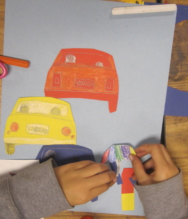
The students and I drew the basic composition out together, however, they had choices of placement for each horizontal or vertical they included in their design. When they added patterns, we used similar ones, but again, they chose where to use the patterns in their arrangement. Some students added smaller patterns in the bigger ones.


Just like the kinder project, color choice was up to them. I did suggest that they could use all the colors or they could limit them. For example, they could use just warm or cool colors, just 2 or 3 that they liked, just primary or analogous colors, etc.

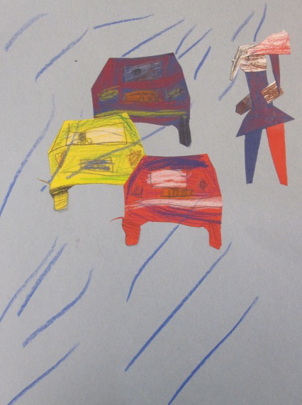
We printed these the same way the kinders did, but then we also printed them again, immediately after the first print while the paper was still wet to transfer a ghost image. When we did this, I asked students if they wanted to print the plate in the same direction of the first or in a different direction. The ghost image was always a bit lighter than the first, but students then added more marker color directly to their print to balance out the color saturation in their design.


Printing patina.

Despite the time crunch, all the students were able to make their prints and touch them up as needed.
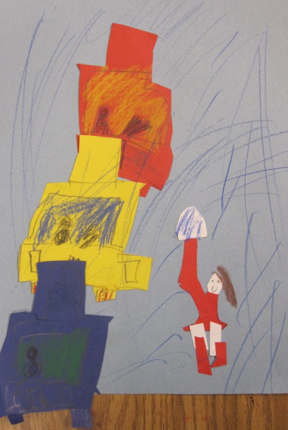
The kids and I were both "impressed" by the quality of their prints:)


Monday, January 28, 2013

repeating with lu. repeating with lu. repeating with lu.

You get the idea:)

This week with kinders and I are exploring bold colors, pattern, and printmaking with the help of Lu Summers, a textile designer who lives in far away England. Lu works a lot with pattern when she creates her screen printed fabrics and her hand pieced quilts. I really enjoy the hand drawn nature of her  printed patterns and the energy of shape and color in her quilt work.

I shared a few of her quilted pieces with the kinders (age 5) and talked about the bold colors and geometric shapes that we could see. I also pointed out some of the patterns present in her quilts, although these aren't as obvious as the ones in her screen printed designs. We talked a little bit about what quilts are and how they can be used to keep you warm and they can look "cool" too.

The image that we focused on for our compositions was an image I had "pinned" a while back. I discovered today that this is actually a section of a larger work. I knew the piece was small due to the pins present in the photo, but I didn't make the connection to the larger piece until after my last class left for the day.


You can see the smaller section in the upper right corner.

Instead of drawing our image directly on paper or painting it, we used styrofoam plates to make a relief print of the image. When we started I talked about how we would use the material their lunch trays were made of to make a stamp. I modeled the process quickly for them and off we went.

We drew out our compositions together. We broke up the surface into 3 or 4 shapes with horizontal and vertical lines. We then used letters to help us create the patterns in the design. Lower case L's, upper case U's, V's and W's, and a few O's. Once the designs were drawn we added color patterns to the different areas. I emphasized not putting their hands on the areas they colored because it wipes off the surface so easily.

When students finished, they came to the back of our center table and we printed the plates. I wet the paper with a spray bottle and sponge over it to even the water layer out, and then we transfer the image together. This is my favorite part of the project, seeing and hearing the kids' reactions to seeing how the image transfered. It's cool when I do my own prints, but it's especially cool when I help kids with this experience for the first time. It's the magic of printmaking:)

After students finished their print I told them they could color it again and make another one. I had more and more kids take me up on this throughout the day. Again, I loved seeing students create multiples for the first time. Some stuck with the same colors, while others mixed it up a bit.

I have to say that I LOVE the way so many of these turned out. Even though they followed the same steps, there is a great amount of variety in the finished pieces. 

I would like to assemble them into a larger image. Those of you who follow the blog know that I can't help myself when it comes to creating larger collective pieces from the kids individual pieces:) I'm thinking it could be pretty striking to assemble digital pics a collection of them and turn it into a poster design. Possible fundraiser? We'll see.


Plate and print.


A small collection from one class.


One student's multiples.


Saturday, January 26, 2013

rainy day with ryo.

Yesterday was my only day with the first graders this week. Since it was raining, I thought it would be cool to use the rain as a theme, especially since we did the icicle collages last week.

I recently got turned on to the fantastic illustrations of Ryo Takemasa. I like his use of flat colors, while still creating depth through shape and overlapping. Some of his work, the plant and animal studies, remind me of the work of Charley Harper.

The illustration that I used for the inspiration for the project is this one. We talked about his use of overlapping to make it look like the cars were behind one another and not stacked on top of each other. I thought the flatness of Ryo's shapes would lend themselves nicely to a collage project, so that's what we did. I told them that ours would not be a taxi scene. It would be a scene of parents picking up kids from school.

I had stapled 3 sheets of primary color paper together for each student. We drew out a basic car shape on the yellow and added some details like tail lights, license plates, and car driver shadows. They drew one car and then cut out all 3 at once. This worked out pretty well. There were only a few students who cut out one car at a time. After cutting the cars out, they added details to the remaining 2 cars and also added colors to each of them with color sticks.

Once the cars were done, I modeled how to make sure they positioned them with overlapping present on their background paper. The kids then glued theirs in place.

We used left over paper, plus a little white paper if they wanted, to add at least one student being picked up from school.

The final step was to add rain drops by drawing them on top of the cars, background, and person. Again, this demonstrated a use of overlapping in art.

I love the personality that shows in the cut paper people and cars in this project:)


Wednesday, January 23, 2013

painting with pnut.

Or Mr. Greg Galinsky:)

Many 4th graders needed more time this week to finish their Hundertwasser complementary color paintings, so I wanted to do something this week that kids could jump into at different times during class and still have success.

I came across Pnut's work earlier this month on pinterest and pinned a photo of a deck series that he had done for FTC skateboards.


I loved the simplicity of the shapes and composition. Economic and clean. Pared down shapes and colors. I thought his work would make for a perfect exploration of monochromatic color schemes.

I introduced his work to the classes via his website. I showed them the pics from his bio page and shared that he is a month older than me. It was so "nice" to hear from numerous students that Pnut looks so much younger then me! Darn you Pnut;)

We looked at some of his commercial work and a few of his paintings. I contrasted his work with the bold, many colored work of Hundertwasser. We talked about how Greg's work has a strong sense of unity because of his use of monochromatic or analogous color schemes. We also identified his use of contour lines to define the shapes in his work, both objects and background shapes. We also addressed his use of tints and shades of colors to add variety to his images.

I wanted students to use Pnut's work as inspiration, not to simply copy it, so I decided to give them a choice. They could use an instrument for their subject or they could use a music listening device instead. I projected images of an ipod, boombox, walkman, record player, and phonograph for the students to choose from.

Students started the project by shaping their board with scissors. They then did at least 2 skethces on the name side of their board. Once they had something they liked, they drew it out lightly on the front and traced it over with a black crayon to make the  contours bold and strong.

I demonstrated how to make tints by adding more water to their tempera paint and how to make shades by adding black.

It has been interesting to see the variations in subject, color, and composition that the students have come up with.


So far, not much love for green. Same goes for the phonograph:)