Monday, October 31, 2011

lesson fail.

Don't you "love" it when you think you have a super cool lesson planned and when you go to execute it with a class, the wheels come off? Me neither.

It happens to the best of teachers.

Since I am using this blog to reflect on my teaching practice, I think it is important to share these experiences as well as all the success stories that take place in my classroom. This will be the first, in a (hopefully) short series of posts that deal with failed lessons or parts of lessons and how I changed them to make sure students don't have a frustrating learning experience with me.

Last Wednesday I had a project planned that introduced 1st graders to the work of British designer Lo Cole. I loved the translucent overlapping that he has going on in the above image and I wanted the kids to create that same effect. To create the birds, students would use tissue paper. To be more specific, they would cut the bird shapes out of tissue paper. This is where things went awry. The kids had such a hard time cutting out the shapes from the flimsy paper. Birds were tearing left and right. To make it even more complicated, I had the kids fold the paper so they could cut out 2 birds at once. They had a hard time keeping the 2 layers together as they cut, so a number of students ended up with 3 raggedy birds instead of 6.

I had done a sample myself before doing it with the students, and it didn't occur to me that they would have so many problems. 

After I met with that class, I decided to switch to using tempera paint and stencils. Students would use primary colors to paint the birds and wherever they overlapped, they would mix secondary colors to fill those new shapes. The results were much better and there were very few frustrated students.

I'm going to reschedule that first class, so they can have an another opportunity to feel successful in art making. 

In hindsight, I could have had students draw the birds on the big sheet and tear small bits of tissue to fill those shapes. Students could use modge podge to adhere the pieces t the paper with a brush.

Lesson learned- do not have students tear complicated shapes out of tissue paper.

Friday, October 28, 2011

3d teddy.

I just met with the 4th graders again. Their first 2 week rotation focused on using contour line to describe shapes. This lesson had them using value and color contrast to define edges of shapes.

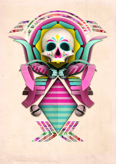
I recently found out about the work of Teodoru Badiu. He is a designer and artist based in Vienna, Austria. He creates most of his images digitally using programs like photoshop, illustrator, and cinema 4d. His visual vocabulary is quite diverse and has created many surreal visual worlds and characters.

When I introduced the students to Teodoru's work I used images from one of his websites. The kids LOVED the characters they saw.

We talked about the fact that Teodoru makes these characters look like they could be real (or at least made out of clay) by using color contrast to define the edges of objects (no outlines!) and by using tints and shades to define their volume.

The image that we focused on was one that was inspired by the Mexican holiday of the Day of the Dead. We talked briefly about what the holiday was about and then revisited what made the image look 3d.
While viewing the image we also identified the symmetry running through every part of the composition. Symmetry creates unity in a design and it also tends to focus the viewer's attention down the line of symmetry. 

This art project involved a lot of folding, cutting, and gluing. Students folded each layer before cutting to reinforce the symmetry of their design. We designed the skull first. I talked about and demonstrated what each of the bumps were on our head. After cutting out e skull, students added shading with a black crayon to it look more 3d and added a symmetrical crayon design to it.

Students then cut the middle and back layers, tucking each layer into the fold of the previous layer to make sure each was big enough. All 3 layers were then glued to the background sheet.

Since Teodoru's design uses multicolored shapes at the top I decided this would be a good opportunity to use the tie dye paper that I had gotten earlier in the year. These are pre-printed 8.5x11 sheets that come in a variety pack. This created variety in their individual designs and also created it across classes for exhibition purposes.

Students cut and applied this paper into large and small shapes to add a variety of positive shapes to the background negative shape.

Different classes had different background colors. There are ones with red backgrounds that are not pictured yet. I chose white for the first class and they did an amazing job constructing their designs, but I do like the ones on darker colored backgrounds more. The skull and other parts really vibrate against the darker colors.


Friday, October 21, 2011

cloudy days.

I came across a cool print made by Georgina Hounsome the other day. I liked the multi-panel layout that she used and economic color palette she chose for the print

I thought the 5th graders would enjoy playing with this format as well. They see it all the time in comics or graphic novels, so they are familiar with the compositional format.

When I shared this image with the students we talked about how the dark shapes appear closer than the light shapes. Georgina creates strong depth very simply through the value of the shapes and their size. 

Students had to approach this project as a collage. 

They started with two gray sheets and could cut up one into smaller panels. I asked them to reassemble them on a larger sheet of white so that all the pieces had a white border around them. Once this was done then they could start adding clouds to the individual panels.

The clouds were done with torn paper and the black shapes were cut out, so they were better defined. It was interesting to see and listening to some students that were struggling with the torn paper step. I believe they are so accustomed to drawing the stereotypical type of cartoon cloud that they had a hard time letting go and creating more abstract natural cloud shapes. I emphasized that they couldn't really go wrong with the tearing as long as they had some variety in the sizes of the torn pieces. I also pointed out that overlapping of the different colors was important because it strengthened the sense of depth in the collage.

When students moved on to the black cut paper step, I modeled how to make shapes like light posts and utility poles have added height by drawing them tapering to the top. This changes the perspective of the image to a more realistic eye level. The objects look like we are looking up at them. I modeled a number of other shapes on the board and they could add other things to their images if they had different ideas.

Students glued the completed gray panels onto the white paper at the very end. By waiting to do this they could trim off any excess cloud or object paper and their panel edges would look nice and sharp.

I'm really pleased with the way these turned out. There were a lot of excellent compositions put together in all the classes. Yea 5th graders! 


Thanks for the inspiration Georgina!

mary's doodle.

I went to do a google search today and was delighted to see the google title done up in the style of Mary Blair. The 5th graders did a drawing exercise based on her work last week. I'll have to share this with them next time they come in.

It would have been Mary's 100th birthday today.


Tuesday, October 18, 2011

george and nancy.

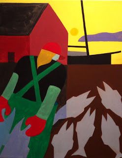
This project was inspired by a print that my in-laws have at their house in Maine. The image is framed right outside the room we stay in when we visit them. I love the bold coloring and the abstraction of the natural and man made forms in the composition.


The image was painted by artist George Anderson. He grew up in Canada and started a very successful design firm that he later sold to devote his creative energy to fine art and painting images of the sea and the people who make a living from it.

I thought it would be nice to keep with the sea them that we investigated with our whale drawings the week before. This time, students made a drawing that depicted the human elements of the sea instead of the natural elements that are found underwater.

When we looked at paintings from his website I prompted the students to identify the different ways George creates 3d space even though his shapes are relatively flat. They discovered that big shapes look close and small ones look far, shapes that start out low look close and shapes that start out high look far, and that overlapping shapes makes one look like it is behind another.


We also discussed warm and cool colors because George often has a very vibrant color palette in his paintings.

Students drew along with me as we created a contour line drawing with our pencils. The coloring was done with Crayola twistable slick sticks. They are a very soft oil pastel that blends very nicely after you put it down, but then dries nicely afterwards. 

I demonstrated how to press very softly with the colors and then blend them into the paper with a finger. The kids thought this was very cool. They really liked the intensity of the colors. We also worked with making colors lighter by adding white or a yellow on top and mixing it in. We did this so that our shapes would look more 3d. Students also added shadows to the water since the sun was behind the objects in their drawings. I like the way these drawings came out, however, I am bummed because the slix sticks go so fast. Ten 2nd grade classes using them is about all I am going to get out of them:(


I decided to work from a number of images that George painted, so that we would have a bit more variety in our art exhibits throughout the school year. 


Thanks goes out to Nancy for turning me on to George's work and thanks goes out to George himself for making so many great abstractions of the Maine sealife.

Sunday, October 16, 2011

peek with lee

Earlier this year many of our students participated in a group project that was inspired by the work of artist Lee Gainer.


Lee has a blog that focuses on one artist each day of the week. The artist for Saturday, October 15... Zamorano! Way to go boys and girls! She also gave props to the school in Boston that I wrote about a couple weeks ago. Kudos to the kids in beantown!

Check out the post here:)


Friday, October 14, 2011

it's a small world.

Totally a small world.


This is another project that was inspired from an artwork that I had pinned a bit ago. When I saved the image I was not familiar with  the artist who made it. I liked the feel of it. Simple geometric shapes, patterning, and brightly colored. The image reminded me of the work of Rob Dunlavey, who I had done projects based on last year.

Well, after googling the artist's name I quickly discovered that this Mary Blair was not a contemporary artist, but a legend in the canon of Disney art and animation. For many years she worked for ol' Walt and she was the art director of animated classics such as Cinderella, Alice in Wonderland, and Peter Pan. She created the look of those films. When Disney was building a little them park in LA he asked Mary lend her considerable design talent to a number of attractions. Mary was the visionary behind the facade and interior world of.... It's a Small World. I love the front of that building and here, I had stumbled across it's creator. Cool to say the least. Very cool.


I really enjoyed being able to share the design work of this trailblazer for women in animation and creative design. Since we are only an hour and a half from the theme park itself, most of the kids in my 5th grade classes had already seen her work firsthand.

While most agreed that the art of the attraction was great, there was more debate on whether the song needed to be played throughout the entire ride:)

After viewing photos of Mary and some of her "cityscapes", we got going on creating our own small worlds. The emphasis was on using a limited range of geometric shapes to create unity in the image. The students could add variety by using different sizes, colors, and patterns to their buildings. We also discussed how animators that work on cartoons that look hand drawn rely on contour lines to define their characters and shapes. 

Students drew out the basic building shapes first, then added different tops and patterns to them. Befor students started to color I pointed out that the contour lines present in their pencil drawings would disappear and be replaced by implied lines because we would see the edges of shapes only when two different colors met up in the composition.

The only thing I would change about the lesson would be to reduce the paper size. Students were working with a 12x15" sheet. A bit too much to fill in the 40 minutes of coloring time they had, after my intro and the pencil drawing.


Tuesday, October 11, 2011

swim, whale, swim!

One of the lead designers at CSA got back to me about our student artists' work today. Erik T. Johnson said that the design team was thrilled by what our fantastic student artists had created based on one of their images. They have now posted several of our students' creations on their client's blog (the French Paper Co.) for more people to see!

Erik also shared that the lead designer for the project was Jovaney Hollingsworth. Thanks for the inspiration, Jovaney, and thanks for the digital shout out CSA!

Way to go Zamorano second graders:)


Monday, October 10, 2011

a whale's tale.

A series of links from one art blog to another led me to the image by CSA  Design that you see below.


My first reaction (to self)- love this!
second reaction (to self)- 2nd grade line project!

It is such a great image. Cheerful and innocent. Rich with line and shape teaching points for my students.
Many of the images that the CSA Design firm has created (and they have made many, many of them) since 1989 have similar characteristics. Not necessarily cheerful and innocent, but rich in teaching possibilities and just very well put together. Very smart sense of composition and design. 

The students and I checked out a number of images from the company website and talked about the use of contour lines to create a variety of natural shapes. We touched upon the balance between positive and negative shapes (character and background). We also spent a few minutes talking about why the whale stood out from the background. A triple answer the class soon found out- due to its size contrast, its color contrast, and that it's right in the middle of the paper!

When we got to the hands on part of the lesson, the construction of the whale was done through direct instruction, but the whale patterning and background underwater elements were up to the students.

CSA used silver ink along with brown to stress the importance of the color of the paper in creating a striking image, but we went with white because I don't want all my silver sharpies to dry out so fast:)

The kids really enjoyed creating their own whale designs. They had a chance to incorporate a wide variety of underwater elements. The smart design of the original image really provided a great template for students to visually succeed with.