Thursday, March 24, 2011

4th grade Art Exhibit at Viva Pops!


Select 4th grade students will have their art on exhibit at a local business called Viva Pops.
Their artwork is inspired by a mural that takes up an entire wall at this store of delicious homemade popsicles. I wrote about the project in an earlier post.

There will be an opening reception for the show this Friday, March 25, from 5-7 pm.


The students selected for the exhibit will be treated to a free pop at the event! A part of the proceeds from any sales of pops to family and friends at the reception will go back to Zamorano to help support our art program.

Hope to see you there! Come out to support our students and school at this special event!

Artist Isaias Crow will be there to talk about his mural and talk to the kids.

Viva Pops store location
3330 Adams Avenue
San Diego, CA 92116


619.795.1080

Monday, March 21, 2011

let's bounce!

As the father of 2 young kids, I have been recently introduced to the beauty of the bounce house. Hours of entertainment for the kiddos with limited bumps and bruises to show for it, and the parents get to kick back and enjoy the company of other grown ups.

It was a treat that I came across the work of the Australian digital design team of Toby and Pete recently. The image below introduced me to their work and immediately brought a smile to my face. I realized that I needed to do a bounce house drawing project with my first graders.

When I shared this with my classes they were as blown away as I was. I talked to them about identifying the light and dark sides of the shapes in the image and how it is important to include these elements if they want to make a drawing that looks more real. When I told them that the image is not a real bouncy, but one created and "drawn" with a computer, many were in disbelief. Again, I reminded them of the importance of showing light and shadow in an artwork to make it look 3d and real.

Before starting on their own jumpys I have the students practice writing their names softly with their pencils so that they can better understand the importance of hand pressure when making colors light on their paper.

We go through the basic shape design of the bounce house together, but I emphasize the importance of making theirs unique and different from the student working next to them. I talk about thinking of where shapes will go and how big or small those shapes will be. After the bounce houses are drawn then students add light and shadow by pressing light and hard across their shapes.

Last year I did an Audrey Flack inspired still life with 1st graders when introducing light and shadow. The kids did well with it, but I think this drawing was much more entertaining for them while hitting on the same art standards.

Thanks for the inspiration Toby and Pete!


Saturday, March 19, 2011

running hot or cold.

I revisited the work of Joe VW, but this time it was with my 4th graders. I knew they would think his stuff was pretty cool, so an image of his would be a good way to get the kids into working with warm, cool, and complementary colors.
We used the above image as the inspiration for our own waterfall drawings. As with the 3rd grade classes we discussed how movement was created through Joe's use of shape and line. We also talked about what stands out the most in this image. Everybody agreed that it was the waterfall itself, and when asked why that part stood out the students were able to tell me that it was because it was brighter than the rest. 

It's all about contrast. I then talked about how using complementary colors (opposites) in an image can create a lot of emphasis and contrast because those colors clash against one another. Students were able to identify the 3 main sets of opposite colors for me very quickly.

When the students were adding color to their images they had to decide to either use the warm or cool complements on the water and their opposites in the background. They also incorporated tints of colors into their drawings to add more variety to the compositions. 

For this project we used Crayola construction paper crayons. I love working with these things. The colors hold up so well on dark color papers and they are no where near as messy as oil and chalk pastels to use in the classroom.
I would like to thank Joe again for sending us a sharp looking print of his night time smog image. It is displayed in my room next to the students takes on his original. The kids love the image!

The above images were created by students in Ms. Kidwell's class. They are one of my rockstar, super on-task 4th grade classes!


Sunday, March 13, 2011

an inukshuk... and ted.

The 4th graders did a project based on the work of Canadian artist Ted Harrison last week. I found out about his work on one of the blogs I follow, the Artist Woman.

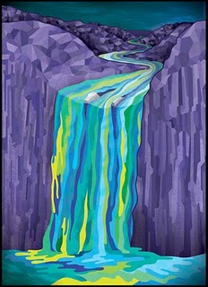
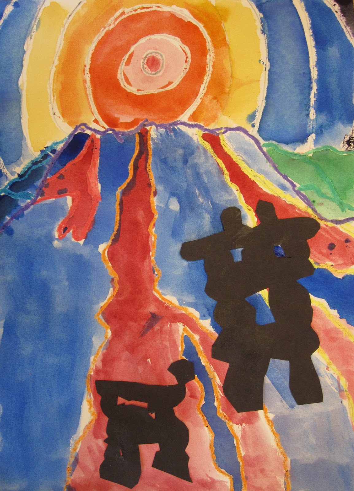
Ted is primarily a landscape painter who uses a strong palette of color in his work. These colors often fill closed shapes and do not blend into each other. His landscapes are of the Yukon territory in Canada. In one of these paintings he included an inukshuk.

An inukshuk is a stone sculpture in the form of an abstract person created by the Inuit people that inhabit North America and the Arctic Circle. These sculptures are not made to be decorative, but are used to communicate messages. I told the students to think of them as "traffic signs" in the wilderness. The arms could point in the direction of a safe passage. They may also be made to honor an ancestor.
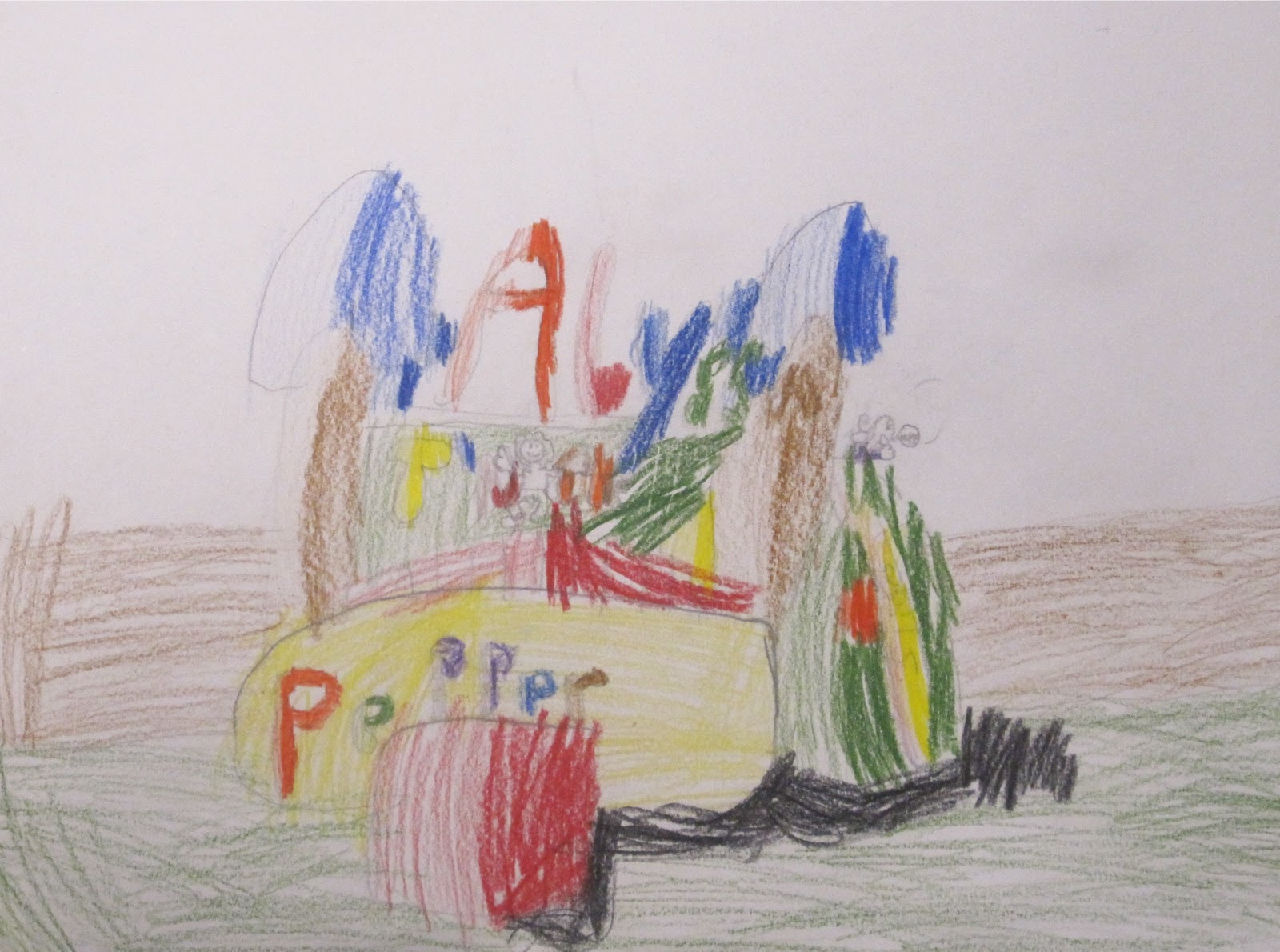
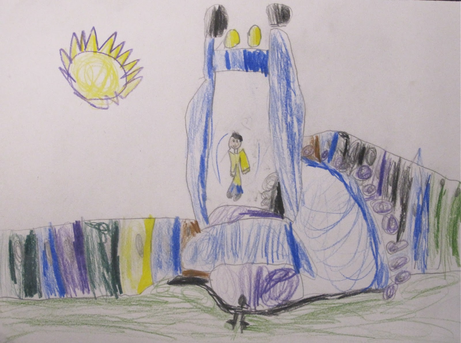
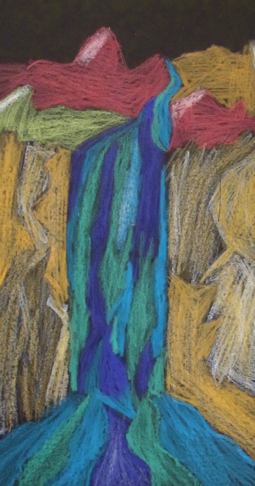
While discussing the art of Ted and the Inuit people, we discussed warm and cool colors and identified them in the above painting. We also talked about positive and negative shapes and how their relationship with one another is very important to the success of an image. These shapes should interact in an interesting way and have enough variety to keep a viewer engaged in the artwork.

We followed the plan that the Artist Woman laid out in her blog post- laying out the composition in pencil, tracing contour lines with crayon, applying watercolor to the paper, and cutting black paper to create our own inukshuks.

When doing the painting I demonstrated adding more water to the paint to make lighter tints of colors. I applied this technique to a stream shape in my painting by starting out dark in the back and adding more and more water to it as the shape continued down to the bottom of the page. By doing this it made the shape look more 3d and added more depth to the painting.

Students were encouraged to use creative thinking to create an image that used warm and cool colors effectively and had an interesting relationship between the positive and negative shapes.


Wednesday, March 9, 2011

a bit lost.

Another project that was inspired by an artist I found on the Pikaland illustration blog.

Chris Haughton is an Irish illustrator and he published his first book this past year. It's called A Bit Lost. It's a great one for the younger kids.
I read the story to the 1st graders and we looked closely at how Chris created motion in a couple scenes by using dot patterns. We also talked about how he created layers of space by overlapping shapes in his illustrations. The students picked up on a narrative pattern that Chris employed throughout the book, which I thought was pretty cool. They are identifying patterns in a variety of media and content areas.

The kids loved the story. A lot of laughing took place while we were going through it.

Once we read the book I guided the students through making a collage based on the above key scene from the story. We focused on overlapping, 3d space, cutting skills, and implied motion, 

We worked our way from the the back of our collages to the front. Everything was cut paper except for the details on our owls and the motion pattern that depicted the owl's path from beginning to end.


Thursday, March 3, 2011

night at the wonka factory.

That was one of my first thoughts after viewing this piece by Chicago based illustrator and designer Joe Van Wetering. 
Joe has done a number of designs for Threadless clothing. I, in fact, bought one of his designs for my wife a couple years ago. I think he has an interesting color sensibility and I like the energy that comes across in his work.

Looking through Joe's website with my 3rd graders, we discovered that he creates movement in his designs in very simple yet effective ways. He often uses simple line patterns and line directions to do it. He also does it with the types of shapes he groups together in his designs. We also noticed how he uses tints of colors to add variety to his compositions and color palette.
The night time smog scene and the waterfall design are prime examples of all these elements. One of the 3rd grade standards is to be able to identify and create movement in art. I thought a project based on one of Joe's images would be an entertaining exploration of this element. 

1. students drew out their evening cityscape at the bottom. It must have 2 layers and use overlapping and value change to distinguish the 2 layers. They have been working with these concepts on a number of projects this year.
2. students draw out their smoke cloud/s that show motion through shape design. They start by drawing the main shape and then break it into smaller wave shapes inside. They may use any of the warm or cool colors for the smoke shapes. They must make 3 shapes tints of colors.

High success rate project and a minimal cleanup project for me at the end of their 4 week rotation that dealt a lot with mixed media and collage elements. It will be nice to have a clean floor on Monday.