Showing posts with label jolby. Show all posts

Tuesday, March 20, 2012

out and about with jolby

I thought it would be nice to revisit the work of Josh and Colby at Jolby one last time this year with a different grade level, so I introduced the 2nd grade classes to their work. The kids, of course, thoroughly enjoyed the collaborative efforts of the Jolby team.

I gave the classes the lowdown on Josh and Colby with the help of their website. We talked about how even though the two of them looked silly (they have a photo of the two of them on their about us page) and had fun creating their work, they took it seriously and always tried their best.

To introduce Jolby's work I shared a commercial they did for the college they graduated from that features a character and other artworks that they created.
Then I shared a video the duo put together as a preview of a show they recently had in San Diego. The kids loved seeing both.

We then looked at a couple more images from their San Diego show, Shapes and Smiles. Both of the images I selected had their basis on memories that Josh and Colby had. One of the 2nd grade standards is to explain how artists share experiences or communicate ideas, so these images offered up good discussion points for how and what Josh and Colby were trying to share with us. Next to both images on the Josh and Colby shared in writing what the basis for the work was, so I could share that with the kids too.

The first day of classes I focused on this image, titled Ready to Go.

We approached the drawing in 4 steps, pencil drawing, marker tracing, colored marker scribbling, and wet brush blending. I asked the students to draw things that they would want to take with them if they were moving or going on a trip. They were asked to connect some of the shapes together with line patterns since patterns are a key element in the work of Jolby.
When they added colors,  I had them choose between warm and cool colors. I said that cool colors could give the image a sad or calm feeling, while warm colors would give it a more happy, upbeat flavor. They chose their colors based on what feeling they would have as they were going on that journey.


The above results were great, but I felt like too many of the students were not having enough success compositionally and with color execution. I decided to focus on another image for today's classes. I still focused on the same standard, but instead of also working with warms and cools, the students had another opportunity to practice recognizing and creating symmetry in art. We did the drawings with colored pencils, sharpies, and pencils.

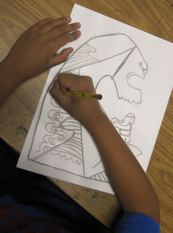
The second image was titled Escaping the City.

For this lesson, the class and I identified what showed symmetry in the image and where it was not present. I pointed out that even though some things did not perfectly match, things on opposite sides were about the same size and shape, so there was still a strong sense of balance.

I asked the kids to think about what they would bring with them if they were heading out to the country or out into a more natural setting for a few days. Oh, and since Josh and Colby added fictional touches to the image, I also said they could add little characters or take other liberties with the things they were going to include in their drawing.

We started by folding the paper to create a line of symmetry and then drew the basket and blanket together. After that it was up to them to add their personal things in a symmetrical way.

When students were ready to color I said they could approach it in a couple different ways. They could make shapes look 3d like they did in their Pearl Fryar inspired drawings or they could color things flatly like Josh and Colby do so often in their work.


I think that more of the students had a better time with this lesson today. Much more of them were in control of the media. The marker and water approach was too messy for the other lesson. 

Great job 2nd grade team!
Thanks for the inspiration Josh and Colby!


Thursday, March 8, 2012

surfing with jolby.

The design duo of Josh Kenyon and Colby Nichols, aka Jolby, recently had a show of new work in San Diego. Lots of cool designs and paintings filled the walls of Subtext Gallery.

I did a project based on a couple of their works last year and was looking forward to doing a couple more this year. I love the playfulness of their designs as well as the intricate patterning that fills up many a shape in their images. The kids enjoy Jolby's work a lot because may of their images are silly. Not all art has to be serious...

The 3rd graders and I checked out a few images from Jolby's website, specifically from the section devoted to the show they had at Subtext. We discussed the use of contour lines and patterns in Jolby designs.

In the end we focused on a painting titled "Ride the Weird". Cool pic to focus on anywhere, but especially here in San Diego because we have got some of the best surf around! (Not that I know this from direct experience, mind you, because I have a "little" fear of the mighty big blue:)

Next to this image on their site Colby offered this interesting background about the image-

“When Josh and I sit down to create our first step is brainstorming and most of the time those ideas start out pretty strange. ‘Ride the Weird’ is an expression we have for when one of us comes up with a strange idea, but then we ‘ride it out’ to see where it goes instead of squashing it and moving on.”

I loved this.

In that design we noticed that motion is implied through the position of the wave and through the wavy shapes of the surfer's arms. Take that, 3rd grade art standard!

I informed the class that we would be using styrofoam plates to create relief prints based on this design. One of the things you can not do when drawing on styrofoam is erase, so I told the class that if they made a mistake or something didn't look right they would have to "ride the weird" and see where that misstep took them.

We drew the design directly onto the styrofoam. Contour lines first followed by patterns. Then we added color with washable markers. Once that was done, I misted paper wet and the students and I transfered their marker images to the damp paper with hand pressure.

If an image came out too light, students could go back in with marker to define those shapes more.

After students printed they were required to do a compare and contrast exercise with their image and the original one that Jolby created. Take that ELA standards!

Great job 3rd graders and great job Jolby for continuing to put together super fun work!


Thursday, February 24, 2011

folk? rock?

I have finally done a project based on a painting by the Jolby design team that I wanted to do for a while. It has been a lot of fun for me (and the kids).
I love the simplicity in shape and color palette. If you look closely though, there is great attention to detail on the guitar and broken line pattern that fills the background.

When I introduced the 3rd graders to the work of the Jolby team the students really got a kick out of the whimsical creatures in a lot of them. We discussed what designers do- how they make our surroundings more interesting to be in, and how they make money and a career by doing so.

I had one student ask if this was a good thing- making things that people like me and you want to buy. Like making a career of selling the products of their creativity was taboo. I loved the question.

When we looked at the above painting we discussed the relationship between the positive shapes (the guitar with hands) and the negative shape (the wavy background pattern). I talked about how this relationship is crucial to the success of a visual image. If the positive image is too small, you are left with a lot of empty negative space. If the positive shape is too simple and uninteresting, the negative shape could be as well.

Keeping that in mind, we set off to make our own versions of the painting titled 'Songs by Robin".

1. started with a 12x12 square sheet
2. cut wavy or zigzag patterns out of a 6x12 sheet of a different color
3. before gluing these pieces in place, like the birdie project, students were asked to think about spacing and direction of the strips to make the negative shapes as interesting as possible
4. glue pieces on
5. add broken line patterns to negative shape with construction paper crayons
6. create guitar body- fold 6x6 sheet in half and draw half the guitar shape
7. decide what is top and bottom, think about position on larger square, and glue in place
8. cut and add guitar neck and tuning board
9. fold sheet for hands, draw, cut, place, trim, and glue  (a lot for "one" step:)
10. add stickers by cutting and gluing paper and/or with construction paper crayons

Again, the variety of guitars, decals, and overall compositions was impressive.

After we completed the project, I walked students through a self assessment. We evaluated how well they met the art standard for the lesson. I modeled this for them and they could discuss it with neighbors if they were uncertain where they scored.
We also assessed their craftsmanship and respect of others for the project. They also answered a couple questions relating to successful and unsuccessful elements of their designs.


This was a new exercise for the 3rd graders and I was very encouraged with how well they did with it. After the class left I went through and checked how they assessed themselves and assessed each of them myself on the same sheet. These will get returned to their teachers to give them more support/evidence for the students' art grades.

An extra note of thanks goes out to Josh and Colby of Jolby for graciously donating a couple copies of their new kids' book, the King's 6th Finger, to our school library and my classroom reading center, as well as a few stickers and bookmarks that I will be using as good behavior rewards. I shared these with my 3rd grade classes today and they were the cat's meow!


Monday, February 14, 2011

what's a jolby?!

Not really a what, but a who...

I have been wanting to do a project based on the work of this Portland based design team for a while. I plan on doing another one based on a guitar painting they did (while listening to much Fleet Foxes... added cool points.).

The 2 founding members of Jolby are Josh Kenyon and Colby Nichols, who met at art school right here in San Diego. Many of their designs have a wonderfully animated style that kids and grownups alike can appreciate that have a great infusion of texture and pattern achieved the repetition of line.


The design I chose as inspiration for this kinder project is the front cover of a cd/album cover for Stacy Clark.
I was attracted to the play of the watercolor up top against the hard edged water patterning at the bottom.
I focus a lot on pattern recognition and creation with my kinders, so this design lended itself nicely to being incorporated into my curriculum.

I showed the classes some of the designs from the Jolby website and we talked about what a designer does, how they use pattern, and a variety of materials to make their work. My classes loved the shoes for DC and they thought the Gibson guitar design was super cool too.

We then looked at the design for Stacy Clark's album and discussed materials and patterns there as well.

We approached this project in 3 steps-
1. paint the upper 2/3 of the paper with watercolor to create a sunset/giant peach/whale head meeting the water's edge
2. draw the water wave pattern on a separate sheet of colored construction paper and add patterning with construction paper crayons
3. cut top edge of waves off and glue in position to watercolor paper

The project went pretty smoothly for a mixed media project with kinders...
The kids enjoyed the painting. we tried to make the sun shape look 3d by starting with mostly paint and a little water and adding more and more water as they crossed the shape.

The cutting portion of the lesson was a good extension of their cutting practice on the Kim MacConnel projects they did the week before.


One kid enjoyed the paint so much he needed to lick the watercolor set. In my 9 years of teaching here this was a first in my class room. It was the black pan. He looked like he was dripping zombie blood...