Showing posts with label relief printmaking. Show all posts

Wednesday, February 19, 2014

pattern and meaning

Last week the 5th graders looked at the textile designs of Malene Barnett and focused on pattern, meaning, and color value.

Malene is a textile designer based in Brooklyn. Her patterns and designs are based on cultures and places that inspire her. There is a great interview at designsponge with her, that sheds light on her experiences and creative process. I shared parts of this with the classes as well as examples of her work from her company website. I talked about where her ideas come from and how much planning, sketching, and refining goes into each of her finished pieces.

 planning!

more planning!

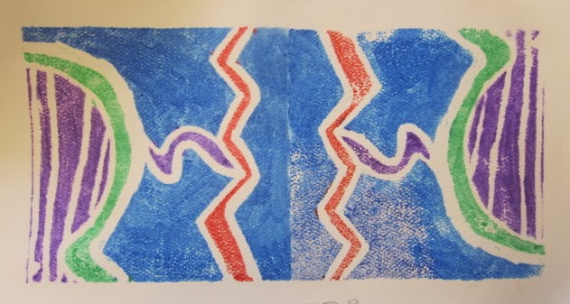
This pattern was inspired by traditional Mexican embroidered textiles

We also looked at how she uses line or broken lines to make colors look lighter or darker than others in many of her patterns. This was another example of creating value in art, something the 5th graders have been exploring in numerous lessons this year.

The students played the role of textile designer with this project. I asked them to create multiple sketches of pattern ideas. These patterns were supposed to be influenced by something that inspired them. Before moving onto the next step, students turned to a neighbor and shared WHY they were selecting one pattern over the others they had tried.After that they created a styrofoam stamp of their pattern. They colored it with water soluble markers, and then stamped it onto another piece of paper. They then were asked to color it at least one more time and stamp it again to create a larger textile design. They could use the same colors or rinse their plate and apply new colors.

When the project was complete, they filled out an exit slip where they reflected on value and their pattern inspiration. (ELA 5.W.10  Writing routinely for a range of discipline-specific tasks, purposes, and audiences.)

These exit slips are becoming routine for all grades now. Instead of getting a "why do we have to do writing in art?" I'm simply getting "where are the exit slips to fill out?"


Tuesday, February 11, 2014

stamping out symmetry... or not.

The 2nd graders are working with value and style this week. So far, their projects have focused on realistic or figurative style. With this project they looked at abstract style in art.

I shared a painting by Arthur Eubanks, an African American artist who passed away at the beginning of the month. We talked about how in this painting, Arthur was more concerned with creating an artwork with an interesting play of shape, color, and value instead of focusing on making it look real and accurate.


We also talked about symmetry in art and nature and I wanted them to be able to recognize if it was present in the work that they were to make. This project was done as a styrofoam relief print. 

We drew out an image inspired by Arthur's painting. The first couple lines we made were borrowed from Arthur, but then students made choices of what types of lines they wanted to go in certain areas after that. I asked students to widen some lines, so they could have thin and thick white lines throughout. We also added a line pattern to one section. This was so they could see how more lines in an area would make a lighter value there.

We colored the block and then stamped it once. Holding the stamp next to the print, I asked the kids if they showed symmetry next to one another. A solid "yes" was their answer. I then asked them to think about if a second print would show symmetry with the first and to answer that question after they completed both prints. 


Students completed an exit slip when they were finished, to see if they could identify symmetry and to gauge what the favorite part of the project was for them.

Due to the nature of the stamp composition, no one had a double stamp design that showed symmetry. Most were able to recognize that, and with some guidance, could explain why it was not present. We will visit symmetry later on to reinforce this understanding.

Wednesday, January 30, 2013

wednesday weird day.

My Wednesdays on weeks that I meet with kinders and 3rd graders is always packed. Now, with our teachers doing breakfast in the classroom, it is even more so. Not a big deal, I just need to adapt. I have one kinder class first, and then I see two 3rd grade classes after that. I used to have 5-10 minutes in between them all, but now I have none.

The kinders were finishing up with their Lu Summers inspired prints, so I decided to do the same project with the 3rd grade classes, with a couple new twists. This allowed me to keep the same materials out for students to use when I switched grade levels.

I shared Lu's work with the classes and we talked about what a textile designer like her does. I talked about she makes quilts and she also makes patterns that are silk screened onto fabric so others can use these patterns to decorate curtains, pillows, shirts, dresses, etc. We identified her use of shape, color, and line to make her patterns.

I explained that we would neither make a silk screen or a quilt, but we WOULD make a print that looked like a small quilt:)

The students and I drew the basic composition out together, however, they had choices of placement for each horizontal or vertical they included in their design. When they added patterns, we used similar ones, but again, they chose where to use the patterns in their arrangement. Some students added smaller patterns in the bigger ones.


Just like the kinder project, color choice was up to them. I did suggest that they could use all the colors or they could limit them. For example, they could use just warm or cool colors, just 2 or 3 that they liked, just primary or analogous colors, etc.

We printed these the same way the kinders did, but then we also printed them again, immediately after the first print while the paper was still wet to transfer a ghost image. When we did this, I asked students if they wanted to print the plate in the same direction of the first or in a different direction. The ghost image was always a bit lighter than the first, but students then added more marker color directly to their print to balance out the color saturation in their design.


Printing patina.

Despite the time crunch, all the students were able to make their prints and touch them up as needed.
The kids and I were both "impressed" by the quality of their prints:)


Monday, January 28, 2013

repeating with lu. repeating with lu. repeating with lu.

You get the idea:)

This week with kinders and I are exploring bold colors, pattern, and printmaking with the help of Lu Summers, a textile designer who lives in far away England. Lu works a lot with pattern when she creates her screen printed fabrics and her hand pieced quilts. I really enjoy the hand drawn nature of her  printed patterns and the energy of shape and color in her quilt work.

I shared a few of her quilted pieces with the kinders (age 5) and talked about the bold colors and geometric shapes that we could see. I also pointed out some of the patterns present in her quilts, although these aren't as obvious as the ones in her screen printed designs. We talked a little bit about what quilts are and how they can be used to keep you warm and they can look "cool" too.

The image that we focused on for our compositions was an image I had "pinned" a while back. I discovered today that this is actually a section of a larger work. I knew the piece was small due to the pins present in the photo, but I didn't make the connection to the larger piece until after my last class left for the day.


You can see the smaller section in the upper right corner.

Instead of drawing our image directly on paper or painting it, we used styrofoam plates to make a relief print of the image. When we started I talked about how we would use the material their lunch trays were made of to make a stamp. I modeled the process quickly for them and off we went.

We drew out our compositions together. We broke up the surface into 3 or 4 shapes with horizontal and vertical lines. We then used letters to help us create the patterns in the design. Lower case L's, upper case U's, V's and W's, and a few O's. Once the designs were drawn we added color patterns to the different areas. I emphasized not putting their hands on the areas they colored because it wipes off the surface so easily.

When students finished, they came to the back of our center table and we printed the plates. I wet the paper with a spray bottle and sponge over it to even the water layer out, and then we transfer the image together. This is my favorite part of the project, seeing and hearing the kids' reactions to seeing how the image transfered. It's cool when I do my own prints, but it's especially cool when I help kids with this experience for the first time. It's the magic of printmaking:)

After students finished their print I told them they could color it again and make another one. I had more and more kids take me up on this throughout the day. Again, I loved seeing students create multiples for the first time. Some stuck with the same colors, while others mixed it up a bit.

I have to say that I LOVE the way so many of these turned out. Even though they followed the same steps, there is a great amount of variety in the finished pieces. 

I would like to assemble them into a larger image. Those of you who follow the blog know that I can't help myself when it comes to creating larger collective pieces from the kids individual pieces:) I'm thinking it could be pretty striking to assemble digital pics a collection of them and turn it into a poster design. Possible fundraiser? We'll see.


Plate and print.


A small collection from one class.


One student's multiples.