Monday, February 25, 2013

strange places.


I met with the 4th graders for the first time today since before winter break. It was good to see themJ

The last 2 lessons we did together focused on the use of tempera paint and making light and dark values with it.

I wanted to continue with the use of light and dark and I also wanted students to apply light and dark to create 3d volume and 3d space. I thought the work of Australian artist Shane Devries would give students an engaging opportunity to see these in action and to apply them in a drawing of their own.

Shane often creates surreal landscapes that have a sense of deep space and 3d volume. He has created a variety of landscape locales in his work. He also has a very interesting collection of characters that he places in these settings in a variety of ways.  I am particularly drawn to the ones he does that have very large creatures hovering or floating in the landscape.


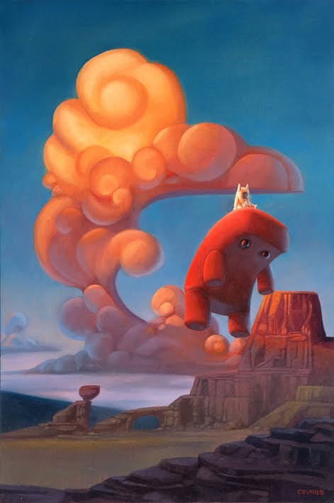
The kids definitely got a kick out of Shane’s work. The characters and scenes drew the kids in pretty strongly. Many of these characters reminded them of characters they have seen in cartoons, stories, and some video games.

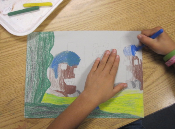
I approached this project as a guided drawing. Students had choices in shape size and position, character detail and expression, and color. Students used color sticks, which are like woodless colored pencils shaped like conte, instead of tempera. This gave them practice making values by varying hand pressure instead of adding more or less water like they did when painting.

I chose to do the drawing on gray paper, so that the students could gain some experience creating value and dept on a value that was not white. This way, they could use white in a more dramatic way to emphasize parts and bring out highlights on shapes.

So far, the students have had a lot of success with the drawing and creating value and space. Since we built the compositions together, students could move on to adding color value variety feeling confident in their drawing, and they could relax and focus more on gaining more fluency with value.


Saturday, February 23, 2013

it was a dark and stormy night on casey street.

We have had some extreme weather for San Diego the past week. Hail and rain! 

I recently discovered the work of Julien Colombier. He makes drawings on black surfaces- paper, canvas, plaster walls. I love his sense of touch. How he manipulates light and dark with shifts in his hand pressure. It's also interesting to see how his vocabulary of images repeats, varies, and evolves as he produces each drawing. 


One of his drawings was a great fit for the stormy weather we have been experiencing. It's called ZZtop Apocalypse. "Charger" bolts, shading, and perspective? Score.

I shared images from Julien's website with each class and discussed his use of light and dark to make things look 3d. We talked about what you have to do to make dark and light values on black paper instead of white paper. (You reverse your usual process- press had for light and soft for dark on black.)

I then shared ZZtop. I focused on light and dark, and I also introduced the concept of one point perspective. Julien used it to make the house look like they were lined up on a real street. This was their first lesson in perspective this year.  I think this image is a great intro to the concept because it is simple enough for many students to achieve success.

I told the students we would be making a drawing together based on this particular image and then I shared a short video of Julien working. The students LOVED the video. Some didn't love the music, but they really enjoyed seeing Julien work. Student engagement in full effect:)


We then drew out the lightning image together. I modeled the perspective, lightning bolts, and coloring shapes. The visual vocab of the finished drawings are similar, but the visual variations are very interesting too.


Tuesday, February 19, 2013

landscaping with jamey.

This week I wanted the 2nd graders to gain a bit more practice creating 3d space in a drawing. They did a great job with last week's Lisa Congdon's icebergs, so I thought it would be interesting if they applied the same set of skills to a landscape instead of a seascape.

I decided to share the work of Washington D.C. based illustrator Jamey Christoph with my classes. Looking at his landscapes was perfect practice for students to identify overlapping, value changes, size changes, and vertical placement in art.

Jamey has a somewhat retro style. Some elements are simplified and others are exaggerated. His work reminds me of some of the settings used in the old Looney Tunes cartoons, I'm thinking of the roadrunner landscapes and bugs bunny/ elmer fudd showdown spaces in particular. I love his color palette too, often muted throughout an image with a burst of color here or there.

I decided to focus on the landscape below. I liked how the trees in the front went from top to bottom and overlapped everything else. This was a lot different than the space of Lisa's icebergs, which, while close, still seemed out of arms' reach.


I asked students to draw as lightly as they could, so the viewer wouldn't be able to see many outlines. Students worked from the front of the image to the back, deciding tree placement, direction of the path, what their bushes looked like, and where those bushes would go.

Next, they used colorsticks to add color value to the drawing. Students made the front dark by pressing hard, and with each layer I asked them to press more softly, so those parts would be lighter and look farther away. The sky color was up to them, the only thing I asked was that they attempt to make the sky darker at the top and lighter by the ground. Students used both the tip of the colorstick to add color, as well as the side to fill in larger areas.


The final step was to go back to the front and add shadows to the big trees and to add plant life along the bottom edge of the paper. This pushed the value contrast in the drawing a bit more, and provided some more interaction between that first layer and the field beyond it.

The 2nd graders are getting the hang of this whole 3d space thing. Next time I see them I'll see how they do with paint to create similar effects:)


Friday, February 15, 2013

a little giant.

As in a sticker. A small sticker.

The 5th graders and I looked at the work of Shepard Fairey this week. I gave the kids a little background into who he is and what he does and then shared with them the image that really got things going for Shepard.


A small sticker of the professional wrestler and Fezzic from the Princess Bride. This sticker went viral at the end of the analog age. I remember seeing them in Philly and New York when I was a senior in high school:)

We looked at how Shepard's style and changed since this image. Much more posterized and abstract. 


At this point in the lesson most of the students recognize his work. Some kids were even wearing his OBEY GIANT brand in class.

At this point we shifted the discussion to logos. We looked at the Obama logo and a couple incarnations of Shepard's OBEY logo and discussed how often times logos are bold and somewhat simple or economical in their design. 

Then I shared the particular pieces of Shepard's that we would use as inspiration.


We looked at the 2 logo variations, talked about the presence of notan, the Japanese design concept that focuses on the play of light and dark, or positive and negative. I explained to the students that they would create a cut paper design and create a personal logo to be placed in the center of their design.

Students made the cut paper design just like they would if they were making snowflakes. They folded their paper twice and then drew and cut out a quarter circle a the bottom of the triangle. They then drew out their design, trying to keep shapes a finger's width apart, and keeping in mind they were going to have to cut the shapes out. 

I asked the students to keep track of their cut out pieces because they could use some of them later. After they were finished cutting I asked them to unfold their paper and reflect on the design. Were there areas that looked to empty? Did they have a variety of size shapes? Was there anything they could still add? They could then refold it and remove paper in other areas if needed. I showed them how to fold the paper one more time to be able to cut into other sections too.

Once cutting was done, they glued the red paper onto white. I then showed them how the could trim some of their cut outs and glue them back on to add more variety to their design. Students could also use a red marker to achieve this effect as well.

Students then drew out a logo in the center and traced and/or filled in pencil logo. I emphasized the use of thick and thin lines. Most students chose to do logos based on their name.

I gotta say, there was a lot of success with this project. Overall compositions, creative solutions, and being critical of their progress. They dug Shepard's work and were engaged throughout the lesson. Good stuff happening in the art room:)