Thursday, May 30, 2013

spinning round with mr. moore.


Testing time!

This week I’m happy to give our 3rd graders (and their teachers)J a break from the stress from the testing cycle they are in.

We are looking at the work of Matt W. Moore, who wears many creative hats as an artist based out of Portland, Maine. Most of Matt’s work falls into the abstract realm. I love his use of bold colors and hard edged shapes in his striking visual compositions. Many of his pieces have an electricity about them, due to his play with the visual elements of line, shape, and color.

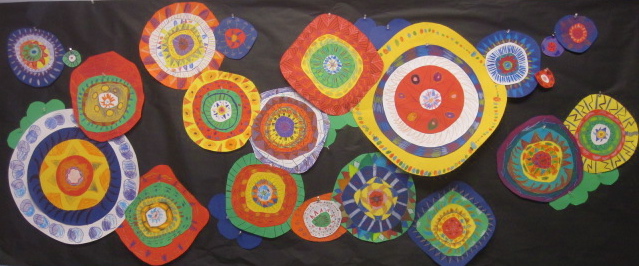
After sharing the range of Matt’s work with the students by checking out his website, we narrow our focus on one mural in particular. Upon viewing this one together, I have students share with me what they see- circles, designs, patterns, colors. I also have them share what makes the circles different from one another in the overall design- the size of them, different patterns, different colors, and so forth.


I also introduce them to the concept of radial symmetry. I talk about how this type is when things radiate or revolve around a central point, like the spokes on a bike wheel or a pizza sliced up.

I explain that each of the students will make a circular design that has a variety of patterns and that is an example of radial symmetry. I also share that their piece will be included in a larger mural type installation inspired by Matt’s mural composition.

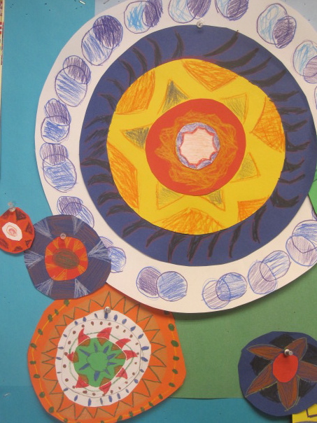
When building their pieces students start out with a extra small (3x3)and small (6x6)piece of paper. They draw a circle on each, cut them out, and glue the smaller onto the larger. Once this is done they add patterns to the two pieces. I show them that they can split the circles into smaller bands, or they can leave them alone and create larger patterns.


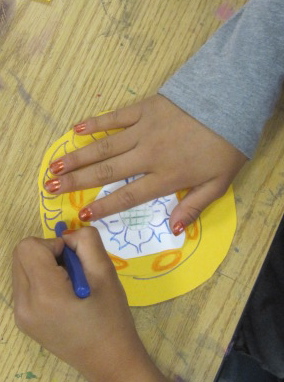
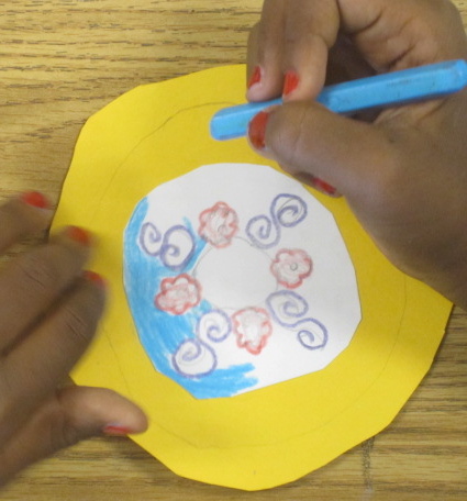
When that part is complete, students get a medium (9x9)size piece and repeat the process. Finally, they get the large (12x12) piece and repeat as well.

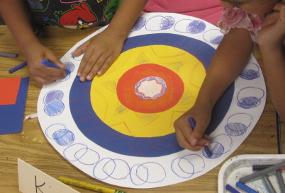
For students that finish early, they may help construct an even larger circle design with others that finish early. These larger ones have not completed in class, so the next class’s early finishers contribute to them as well. Students also have the option of creating a smaller, mini version of the circle design, either by themselves or with a partner.


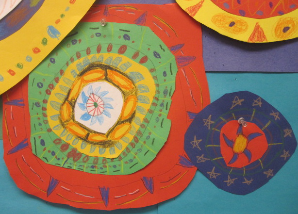
Below are a couple ideas for installation, along with photos of individual student designs. I’m thinking I would like to have at least 3 large scale compositions to hang as a large installation, or as individual hangings that would be spread out through our annual art show, which is only 4 weeks away!


The family and I are headed back to Portland this summer to visit my in-laws, so I’m looking forward to tracking down his local mural spots and seeing some of Matt’s work in personJ

Thursday, May 23, 2013

porkchop pop?

This week the 1st graders and I checked out the work of Leonard "Porkchop" Zimmerman. He is a painter living in Georgia who paints a lot of robots. These paintings are often fully saturated with color and emotion. There is a lovely energy and narrative to many of his works.

We looked a few of the images rotating through on his website and then focused on a couple images that were clear examples of Porkchop's use of line, shape, and color value to make his creatures look real and 3 dimensional.

The image that we re-interpreted was a monkeybot painting that Porkchop did for a local children's hospital. We talked about how the bot was made up of a bunch of cylinders- long, short, thick, and thin. We also talked about how he used light and dark to make some of his shapes look more round.


When we did the drawing together it was pretty direct. Students followed along as I built mine up front. Students had choices to make in terms of details, and color. We drew the monkey on a smaller piece of brown paper, traced and colored it, and cut it out. Once that was glued onto a white sheet we added the rest of the monkey and color.


Even though the students had the same steps to follow, many of the monkeys have distinct, wonderful personalities.

Thanks for the inspiration Porkchop!

kimmy's words:)

I shared a couple of posts about the 4th grade clay faces with Kimmy Cantrell and he kindly took a few minutes to offer our students encouragement and some food for  thought.


I love what you did with the kids, and I always love watching how kids interpret my pieces, and put their own spin them! They really made me smile!!! It's a wonderful compliment that you have them use my work, as the subject of one of your art projects!
Tell them that I love them, and try maybe incorporating some other materials, to make them even more interesting, and to see how some materials compliment one another!
I just put up a new facebook page, (CLAY BY KIM), and I'll make sure I use your bog on there, to share with my new facebook friends!

I actually just finished doing a little artist visit with some 3rd graders here in Atlanta, who did similar project recently! Their teacher (Jodi Bricely) invited me to speak with them, after they finished their project!
Keep up the great work, and keep me posted on your future adventures!

Kimmy


Here are the last few Kimmy Cantrell inspired clay faces that the 4th graders did.


Tuesday, May 21, 2013

a few more faces.

A couple more 4th grade classes painted their Kimmy Cantrell inspired faces today. The kids are doing a great job with this project. Also, the painting today was not nearly as messy as it was yesterday. I think I managed supply distribution better today and that went a long way as far as keeping things neater and more organized:)


Monday, May 20, 2013

coloring with kimmy.

What a mess!

The 4th grade classes are painting their Kimmy Cantrell inspired clay faces this week. I have them using acrylics instead of glazes to achieve a bit more of a matte finish on the pieces instead of the high gloss glazes the other grade levels have been using on their projects.

First thing the students do is paint their clay face completely black to get some of the dark lines and under tones that Kimmy gets in his work. I have added water to the black acrylic to make the paint easier to apply. Every 4 students shares a cup of paint. They use 1" round brushes to apply the paint.

After this, students do a color study/ rough draft of their face, so they can plan out what colors they will use and where they will go.

I do a quick demo of paint application with a smaller brush. I show them how some of the colors look really dark over the black and how they can apply a couple coats of those colors to make them stronger. I also show them how to add a little bit of white to colors to make them brighter. Students are allowed to do color mixing on their sketch paper and "tablecloth" paper, as long as they clean their brush when dipping it into the needed colors for mixing. They then dive into the color painting.

The results have been pretty cool. An interesting range of color approaches. Like I said, it has been messy. Some kids have gone a little overboard with color mixing on their paper, but in most cases it has been cool to see them explore different color combinations. Some students have focused more on painting their hands than their faces. This has not been so cool;)