Thursday, January 29, 2015

surfin and shading.

The 3rd graders started their value unit this week. We looked at a few paintings that Mario Quezada did on skateboards for inspiration.


Students pointed out the things they saw in the designs. I nudged them along to also describe the light and dark colors they saw in them too. I used this point to talk about tints and shades of colors in art. In this case, the different values are used to add variety to the designs, but I talked about how light and dark colors can make an image look more and 3d too.

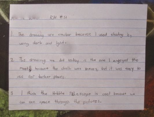
We had an interesting PD yesterday and one of the things discussed was that students understanding of the content increases when they know why they are learning about it. What is the purpose of the learning? To that end I wrapped up my intro with the following-
Why practice creating tints and shades?

Well, I tell them, one of the main reasons the video games play look so real is that the programmers and artists who design them use the element of value effectively to create light and shadow in those games. So, my students who are interested in designing games, or becoming an illustrator, they are going to need to nail the use of light and dark in their work. Not, obviously, right away, but their time to practice and evolve starts right here, right now,  in elementary school.

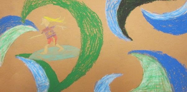
The students were to use Mario's work as a resource. I explained that our goal was not to copy his work, but use it as inspiration for a fun way to practice making tints and shades.

The project can break down into a few steps-
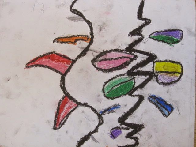
1. Draw the surfer. Start with the waist and go from there. Talk about how a surfer uses their arms and legs to balance like the kids do on a skateboard. Then add the board.

2. Draw at least 6 waves and then add a couple curved lines to break up the bigger waves into smaller parts. Emphasize not to copy your example. Tell them to respond to their drawing as they go. IF they have a lot going on in one area, add shapes to another part. If they have a big open space, think about adding a wave to that area to make it more interesting.

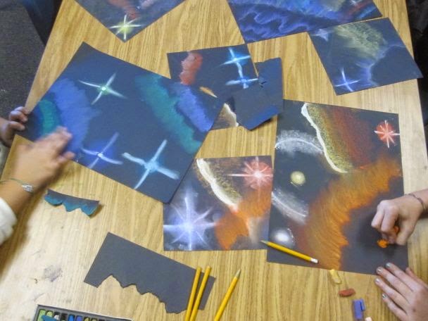
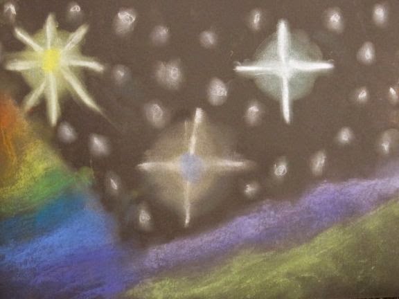
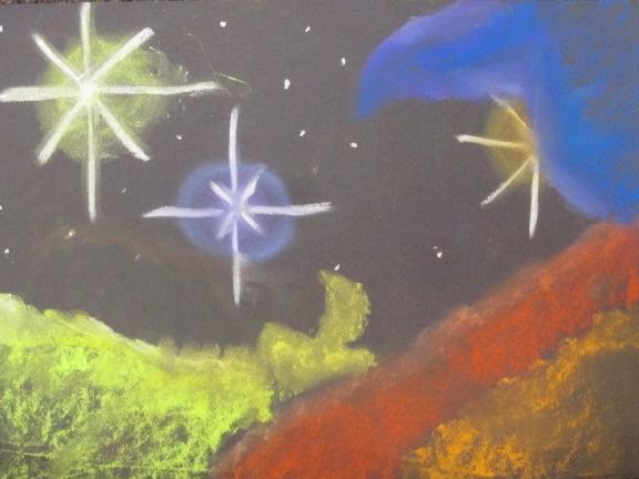
3. 6 shapes gives them enough waves to color with a couple colors and tints and shades of each of those colors. Color the waves. With tints, shades, and the colors by themselves. If waves are left over, they can make them white or black or create more tints and shades. We used oil pastels, but color sticks, or construction paper crayons could work too.

4. Color the surfer. We used color sticks so the kids could capture more detail than with the oil pastels.

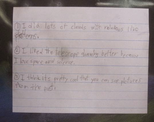
5. Complete an exit slip that gets the kids reflecting on what they did in the project. Ours had 3 questions.
          -How did you create tints in your project?
          -How is your project different than Mario's?
          -What question would you ask Mario about his skateboards or art in general?
    
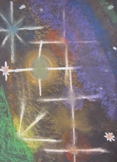
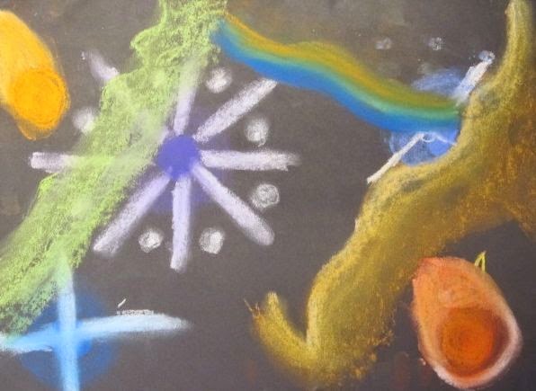
adding a color on top of white softly to make a tint.

making shades.


Reflecting and writing.


I love this question for Mario:)

Check this out!

One of the awesome things about focusing on living artists in my curriculum is that I can reach out to them, share what the kids have done with their work, and get feedback from that artist to share with the kiddos. Just last week, Jason Messinger took the time to answer 5 questions the 2nd grade students had for him.

Well, Mario took it one step further and answered the questions up there^ in this post in a video! He wanted to make it even more real for the kids. Indeed, it will. Thanks Mario:)


Jason answers a few questions:)

Last week the 2nd graders did abstract landscape drawings inspired by the work of Chicago based ceramicist Jason Messinger. Part of their exit slip was to write a question that they would like to ask him. I selected 5 questions and Jason was kind enough to respond to the kids:)

Here's what he had to say.


1.  What inspired you to become an artist? Amir, room 739

I've always been interested in making art - since I was a little kid.
I studied art in college, and been working as a full time professional artist since then.


2.  Why do you make your trees flat? Elsa, room 735


I wanted to reduce the complexity of the images as much as possible, but still leave them recognizable.


3.  Why do you use clay for your art? Nathan, room 43

Clay is a great medium, you can do almost anything with it. Combine it with glazes and you have a colorful material that can be turned into anything you imagine.


4.  What music do you listen to when you draw? Sophia H., room 739

I actually don't listen to music when I make art. I like to be quiet with my thoughts - or even not thinking but just being in the flow of making the artwork.


5.  What made you think of making shapes into fictional things in the outside world? Jordan, room 42

I have always been interested in the boundaries between representational artwork and pure abstraction. I wanted to explore how simple I could make images that still inspired viewers to 'read' actual things into the images.

Jason was also posted the lesson and students projects on his own blog. Thank you kindly, sir.

Wednesday, January 28, 2015

making lights and darks with Budi.

This week the kinders are starting their value unit with me. I wanted to do something that had a good bit of repetition in it, so they could have an opportunity to practice making light and dark values over and over again. Next week, we will apply this practice to a different looking project.

I am using an illustration by Budi Satria Kwan as the focus of this lesson. I came across his work on pinterest recently and thought this illustration had the elements I was looking for- repetition of shape and values, simple, and a bit playful for the kinders.


I started the lesson by reviewing the tree collages we did last time that focused on geometric shapes. I explained what value is, and then I shared a short video interview with Budi. 

This personalized Budi and the kids could see that he is a pretty young artist. He does mostly digital illustrations that become posters and t-shirt designs. (I actually a couple of his t-shirts that he designed for Threadless. I didn't realize this until scrolling through his portfolio and watching the interview:)

When we looked at the above illustration, I had students identify what they saw and how one part of each leaf was light and the other part was dark.

Before starting the drawing, I introduced oil pastels to the kids. I described them as softer, messier crayons with really strong colors.

We did the drawing in 4 parts-
1. drew out the plant stems and leaves in pencil
2. pressed hard and soft with oil pastels to make light and dark values
3. added white to a few leaves to see how that can also make colors lighter
4. traced the pencil lines with black to make the colors pop out more against the white background


At the end of the lesson, we wrote out a sentence together about our drawing. Classes have done some different sentences, but all students needed to count their leaves and include that number quantity.


 some students drew A LOT of leaves:)

 some students got a lil' funky with their stem lines:)


FYI- prepare for some chuckles from the kids when you say his name. Anything that sounds even a little bit like "booty" is gonna get some laughs with 5 and 6 year olds:)

Sunday, January 25, 2015

more messingers.

Here are a couple more groupings of Jason Messinger inspired abstract landscapes that the 2nd grade classes did this week. The students did a great job of doing multiple sketches and creating their own unique landscapes using a simple vocabulary of shape and color.


Friday, January 23, 2015

hubba bubba hubble.

Since it is the 25th anniversary of the Hubble telescope being put into earth's orbit, I thought it would be cool to revisit a project with my 5th graders that I did a couple years ago. With this project they continued their value unit and created 3d volumes with tints and shades.

I started the lesson with a quick review of the Julien Colombier inspired project they did right before winter break. We talked about how they used light and dark to make shapes appear 3d and how they used one point perspective to create 3d space in their drawings. At the end of the Hubble lesson they had to identify how this drawing was similar to the Colombier drawing they did, so this review was important. (and heck, it was important just to jog their memory, since they did that project over a month ago;)


I then shared some background info on the telescope. Talked about how all this money and time was put into it and when they got it into space the darn thing didn't even work! Talked about how the telescope is like a time machine because what we are seeing in the photos actually happened a LONG, LONG time ago. It's always a trip sharing images from the telescope and looking at the deep reaches of outer space with the kids.

After that, we practice a few techniques with the chalk pastels. They are required to use each technique at least once in their final drawing. When they are done practicing, students draw their outer space scene on a larger piece of paper (11x15"). I have photos up on my smart board for inspiration. They aren't expected to copy the photos, but they can borrow elements from them and get inspiration from them.

When students finish their drawings they must complete an exit slip with the following questions-
1.  How is this drawing similar to the Julien Colombier inspired drawing?
2.  Which drawing project did you enjoy more? Explain why.
3.  What do you think of the Hubble telescope?


Tuesday, January 20, 2015

abstract landscaping.

And we're back!

Right before winter break, the 2nd graders started their value unit. They used value to create 3d solids and 3d space in a drawing inspired the topiaries of Pearl Fryar. They tried to make their drawings look as realistic as they could. With this week's project, inspired by the modular clay tile works of Jason Messinger, I wanted to give them a chance to play with some simple landscape shapes, while still exploring how value contrast and shape size can create space and visual interest.

Jason likes to walk the line between representation and abstraction in his work and I wanted the 2nd graders to gain some experience in this too. I've had this image pinned for a while, so was/am excited to break out a lesson inspired by it:)

Versailles, France modular clay mural by Jason Messinger


I had the students do some preliminary work before starting their final drawings. First, they created color value scales. One with just green and another with yellow and green. We talked about pressing hard and soft to create the different values. They then drew a few simple landscape elements- pine tree, cypress tree, setting sun/bush, stream/path. The 3rd step was to put them together in an interesting way in 2 sketches. They needed to overlap at least once and change sizes from big to small somewhere.


They then got an 8x8" white square to draw on. When they had their chosen composition drawn, they could color it with any of the color values they made in their scales. The one rule was that shapes that shared a side could not be the same color.


On their exit slips, students had to identify how their new landscape was different than their Pearl Fryar ones. I also had them come up with a question to ask Jason. I will be collecting these and sharing some with him later this week.


My plan is to have different classes do different color schemes. I'm thinking blues for tomorrow. When we display them, I'd like to group them like Jason does and have the students help with the placement of the individual panels.

It's great to be back working with the kiddos!