Wednesday, March 25, 2015

warm and cool pendletons.

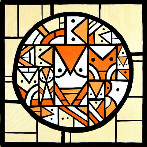
The 3rd graders got pretty messy with their chalk pastel cacti last week, so I thought I'd give them a cleaner project to try out this time. We're still focusing on warms and cools, but we are looking at an artwork that looks a lot different than our Jenny Willigrod inspired cacti, too. The painting below is by one of my favorite designers, Don Pendleton. I usually do at least one project inspired by his work each year. (Like this, and this, and this:) You can discuss many elements when looking at his work with kids- types of lines, types of shapes, color, focal points, and even art history by linking his work to the cubists and abstractionists that have come before...


I'm beginning to play with visual thinking strategies in my instruction, using it as a warm up, in hopes of having our classroom teachers explore it with their students next year. When I shared this image with the classes, I asked them to quietly look for a minute, then I asked- "What is going on here?" After each response, I paraphrased it, and then asked for more from other students- not what else is there, but "Is there more going on?" Students were able to break down and identify so much about the image, using a great deal of vocab. I'll be continuing this and going further with the approach with each grade level this year. As I've been learning about the approach, the benefits/skills should lend themselves well to other subjects, especially ELA.

Anywho...

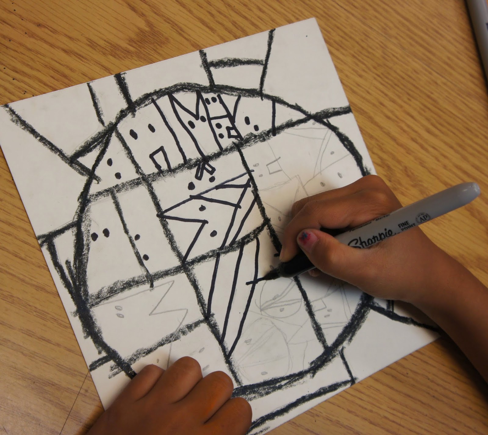
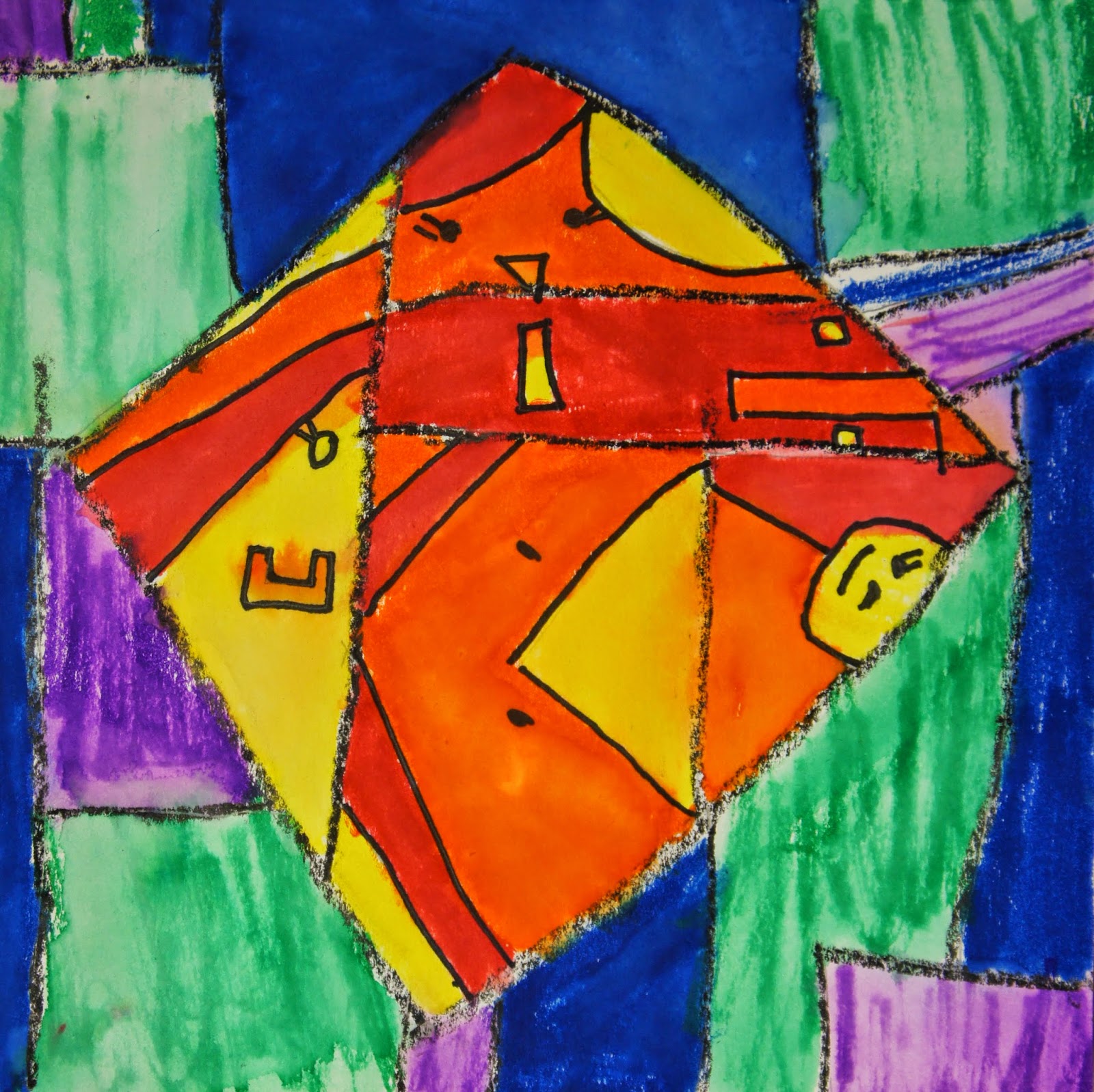
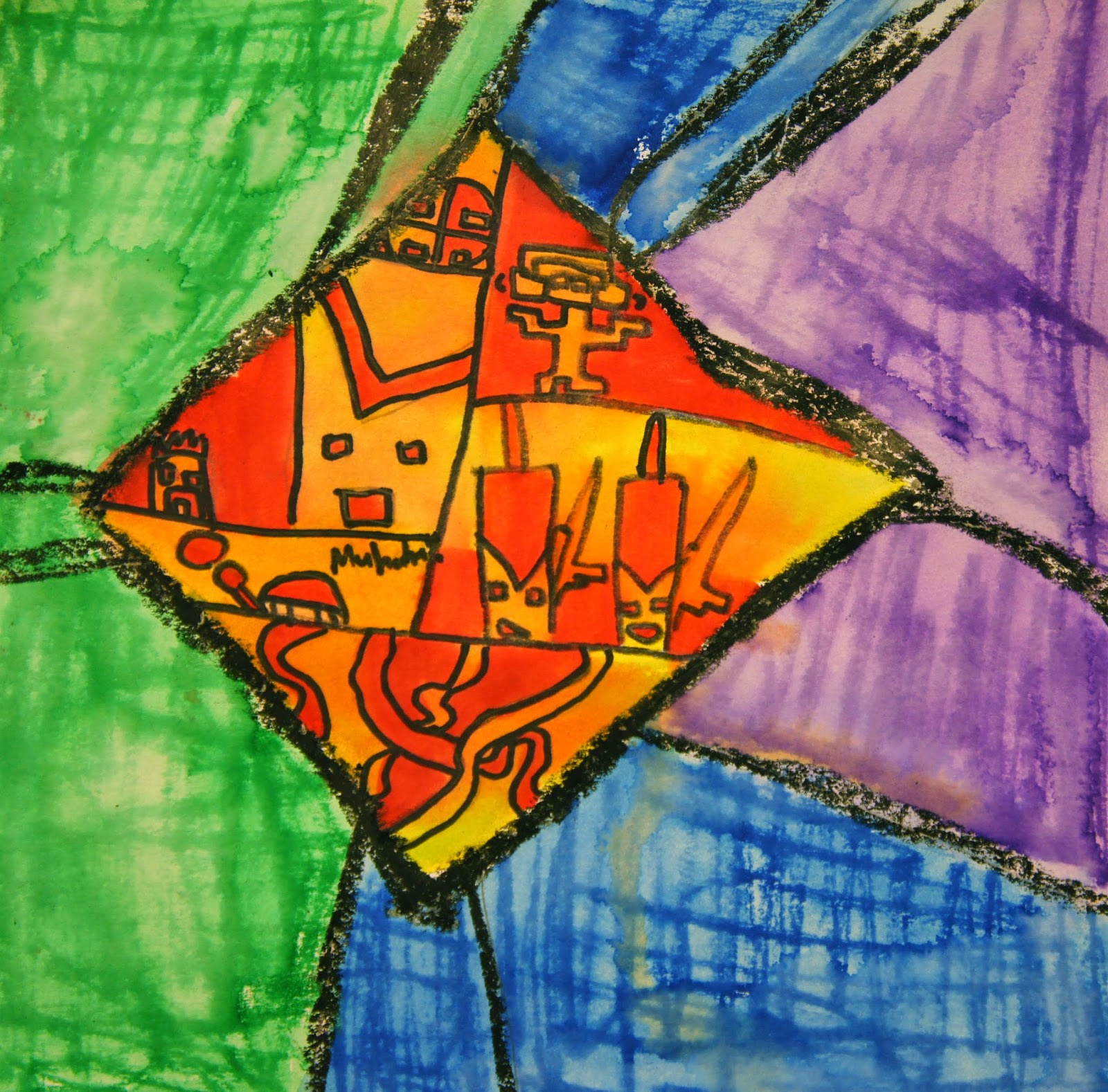
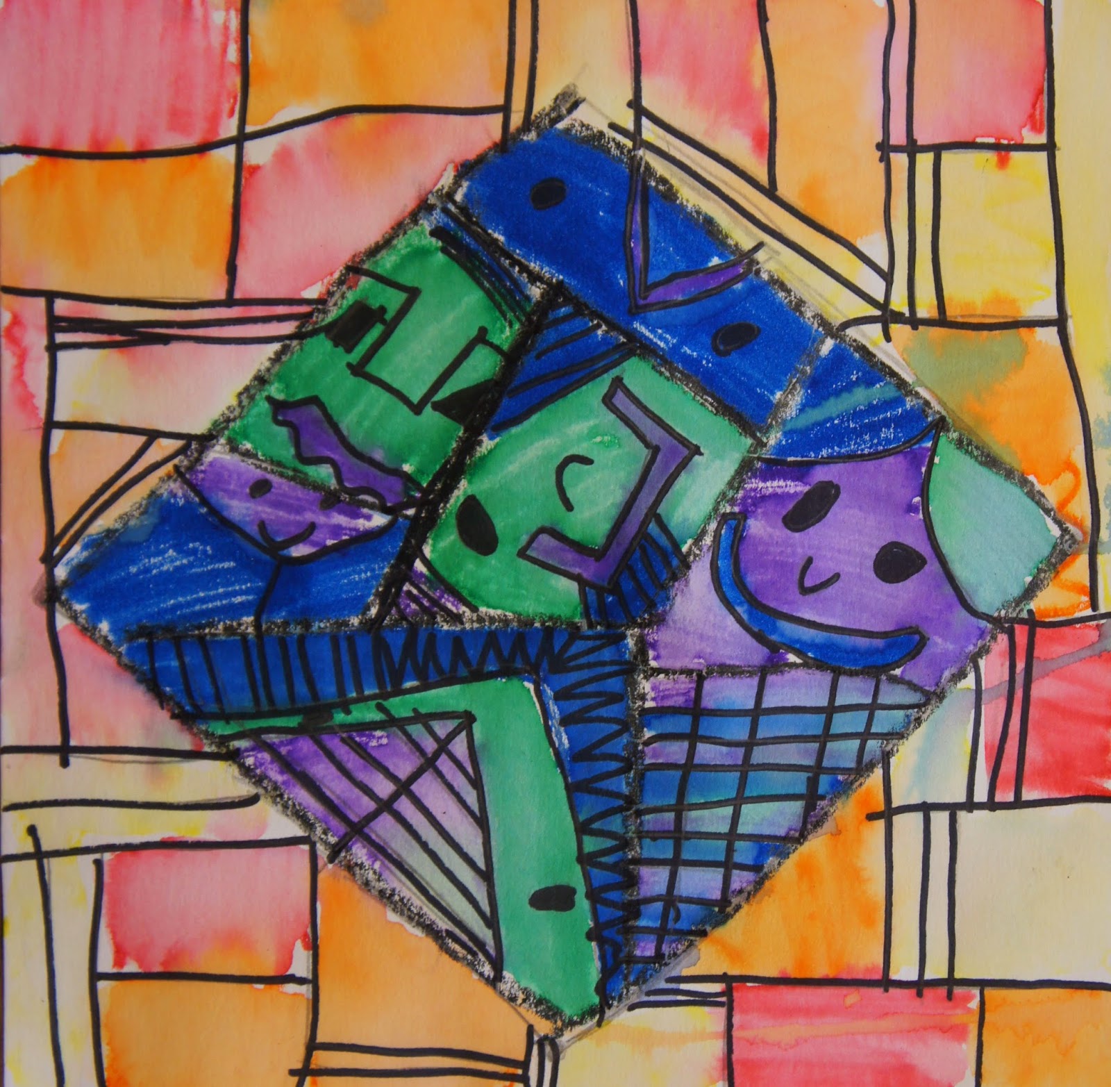
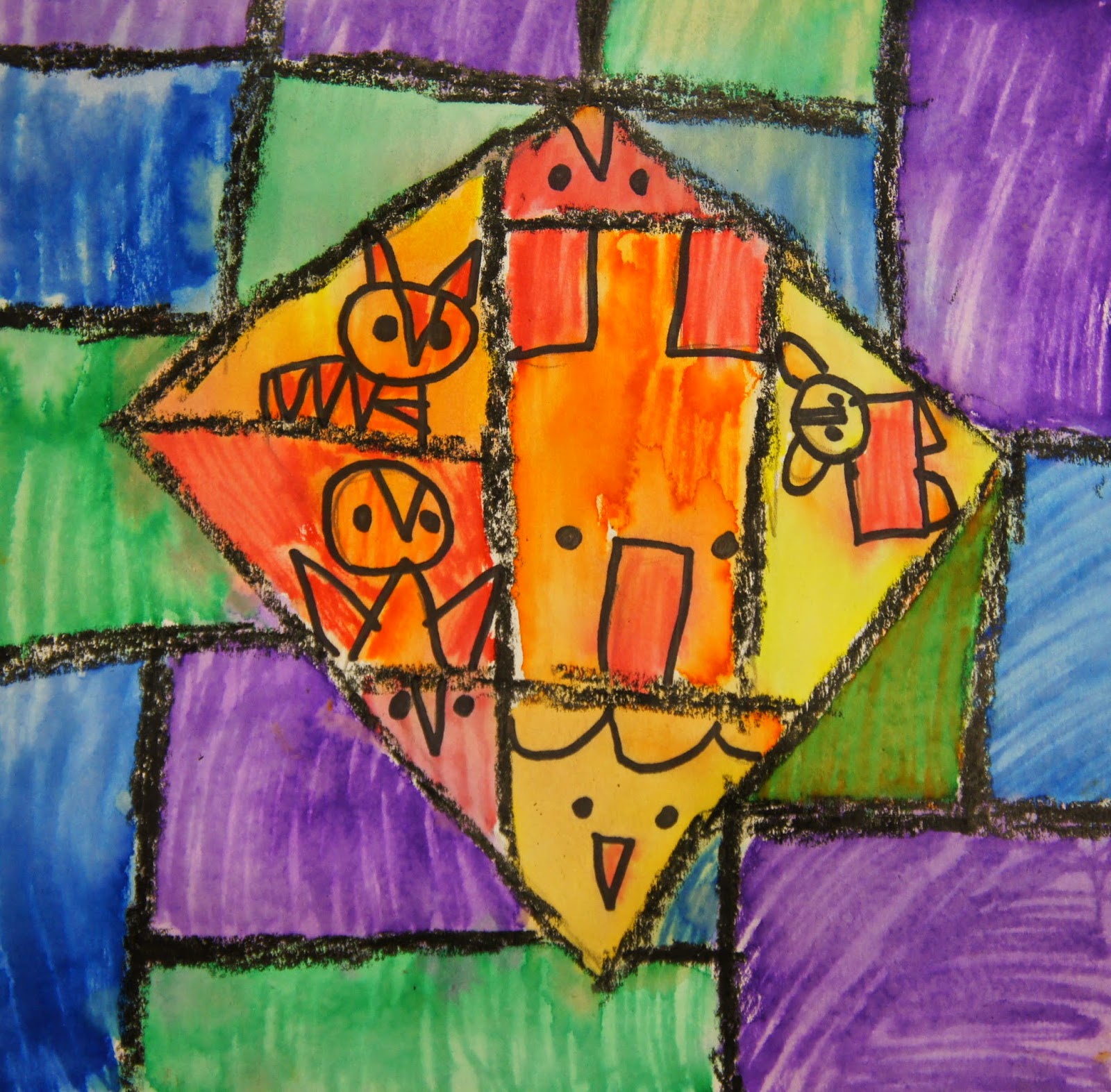
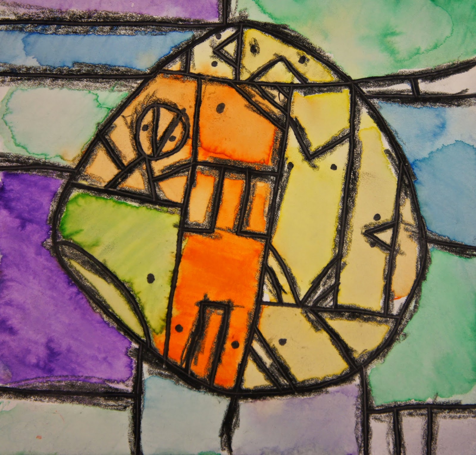
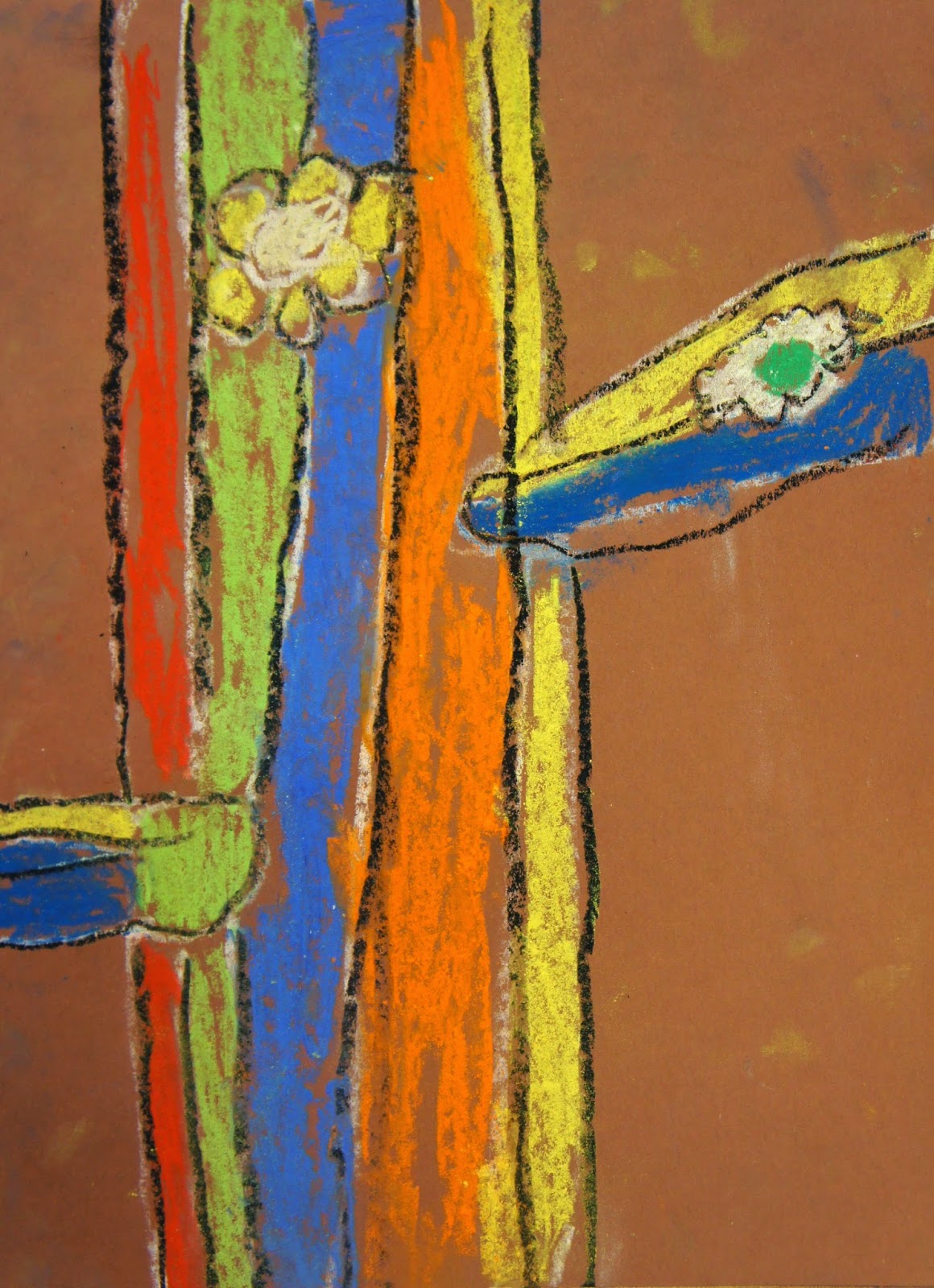
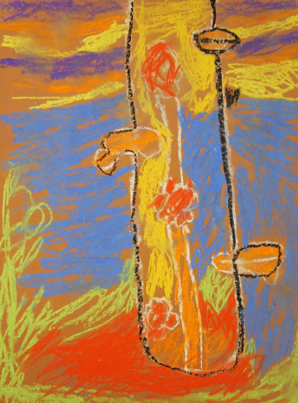
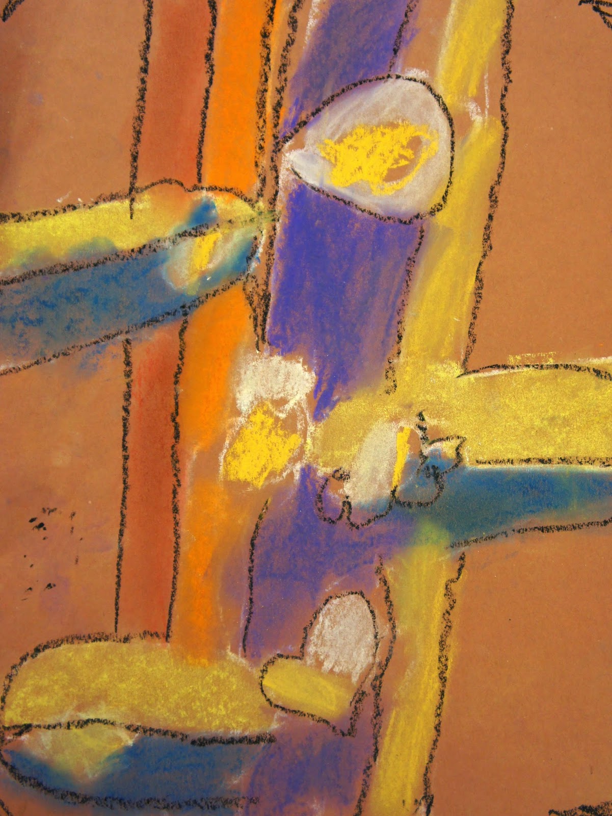
Students started their own versions by drawing a large central shape- circle, diamond, or square. They then broke up the shape and the background with verticals and horizontals. They could fill the interior shapes with any characters, any things like wanted. Some went with Don's vocab of shapes, others did their own thing. They traced their lines with black crayons and sharpies to make them bold and strong.
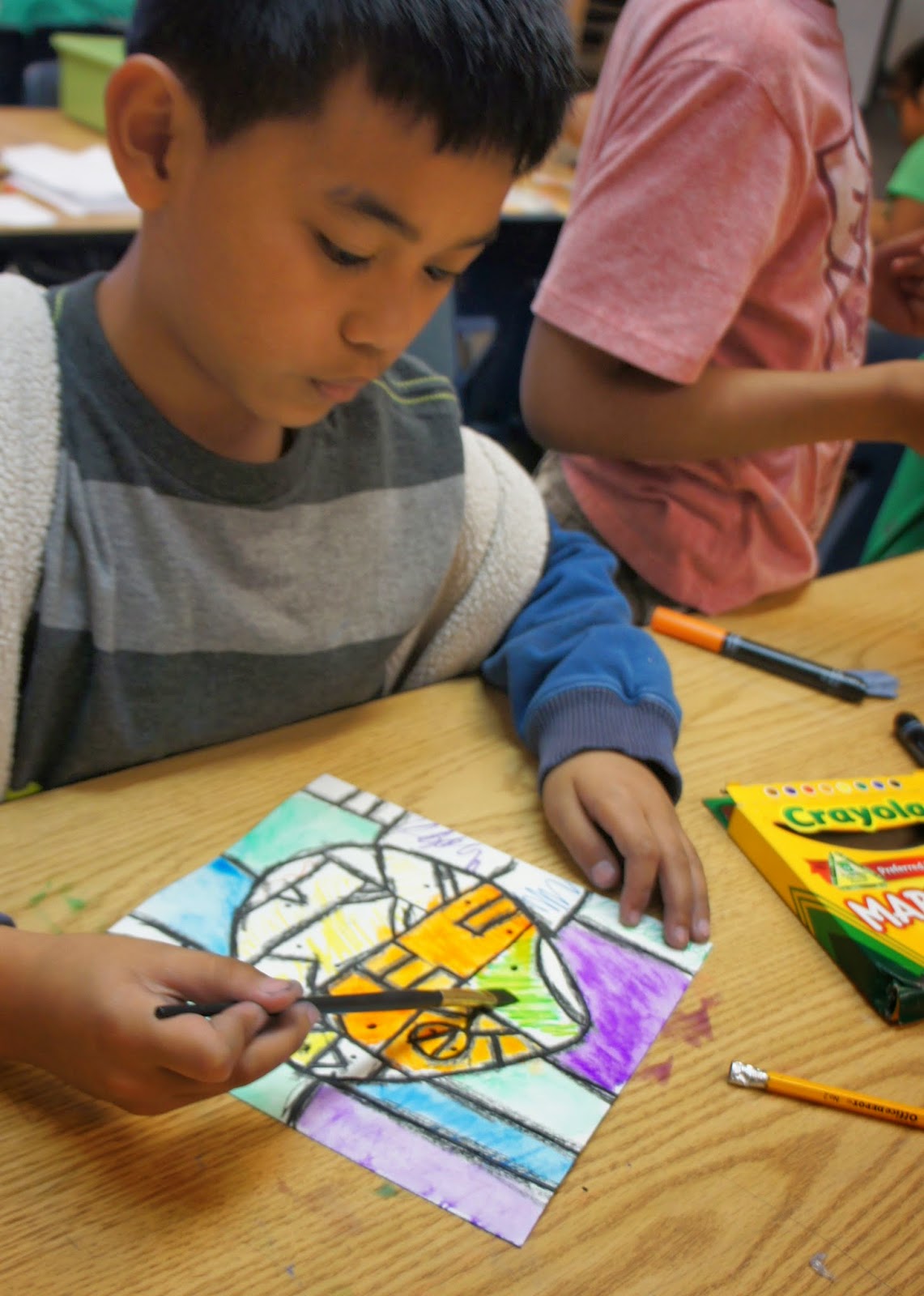
Students used either warm colors or cools inside the main shape and the opposite on the outside. They used crayola washable markers to color.

They went over their marker parts with a wet brush to create a painted effect and to fill the shapes in more completely.


As usual, students completed an exit slip. I asked them to identify how this painting project was similar to their cacti drawings. They also needed to express which one they enjoyed more with a "because" statement.


Monday, March 16, 2015

finding balance:)

A few weeks ago, Nic over at Mini Matisse, posted about dealing with stress and the importance of finding balance amongst all the many hats we are wearing professionally and personally.

It really struck a chord with me, as I'm sure it did with many other readers.

Well, it was in the mid 90s over the weekend and we headed to the beach to beat the heat. While we were there, I took one of my kids' shovels and did something I hadn't done in quite some time- a temporary mandala. I started doing these in the middle of the night back when I was teaching summers at Bucks Rock camp and then I continued doing them in different cities or places I'd visit. Some would take hours, others were done in short little bursts.

Anywho, doing this at the beach felt GOOD! Getting lost in mark and pattern making, talking to people as they came up and watched, not paying attention to what my own kids were doing;)

Balance is important. Maybe I'll start doing some more of these again...


Here's one that I did at camp:)

Friday, March 13, 2015

colorful cacti- 3rd grade style:)

Like the kinders this week, my 3rd graders are also looking at the brightly colored work of Jennifer Willigrod for inspiration in their first color unit lesson. They are learning about warms and cools too.

We are starting the lesson by reviewing how they created tints and shades in their value unit. (cool side note- we heard back from all 3 of our focus artists about those projects:) Then we look at how Jennifer uses the contrast of warm and cool colors to get her subjects to stand out against the background. We talk about how Jennifer chooses plants that are from a warm, dry climate and how San Diego has a similar climate. Lastly, we talk about how Jennifer uses chalk pastels to create her richly colored desert plant drawings. Be prepared to get messy, kids!


We draw out the cacti together and then choose warms or cools to fill them in. The opposite set of colors is used in the background. To wrap up the exercise, students complete an exit slip that asks them how their drawing is similar to Jennifer's, why they chose the colors they did on their cacti, and what they think the most successful part of their drawing is.

 Committing to warm or cool cacti:)


Trying to hold the paper steady by touching empty spots and drawing without resting the drawing hand/arm on the table!

Reflecting and analyzing.

 Instead of using tints and shades to make their shapes look 3d as in previous lessons, students went from the darkest of their warm/cool colors, to medium, and then light.


Thursday, March 12, 2015

kinder colorful cacti.

This week the kinders are moving into their color unit. I'm using a chalk pastel drawing by Arizona artist Jennifer Willigrod as the focus for this project. I shared that Jennifer lives in a hot,dry climate like we do in San Diego and that she often draws plants that live in that type of climate.

We started the lesson by reviewing light/dark and hard/soft by looking at an example of the Melissa Sweet frog habitat drawing they did the last time they were with me. I then introduced warm And cool colors to them and showed them where to find them in my classroom.

We then drew out our cactus with white chalk. I emphasized pressing softly, so that if they needed to make any changes they could easily rub it out with their super fancy eraser (their finger;).

Next, we added warms and cools to the drawings with chalk pastels like Jennifer does. The final step is to trace the white lines with a black oil pastel. This brings back the details of their line drawing.


The kinders are working with sequencing narratives in their writer's workshop time back in class, so I applied the same thing to our reflection activity at the end. I asked students to tell me what we did first, next/then, and last. I modeled writing the sentences and they tried it out too.


Monday, March 9, 2015

mixed up muppets. in print:)

Happy Monday, people!

Thought I'd share this. My article about the Thom Pastrano lesson will be in the April edition of Arts & Activities. This is the same concept that we applied to the Book of Life projects this past fall. Sadly, I won't be able to attend NAEA in New Orleans in a few weeks, but my article will be there at the A&A booth:)

There's something else coming up with A&A and I, so look out (in a lil' while;)


Friday, March 6, 2015

being banksy.

This week, my 5th grade rotation was interesting... Let me just say that when classes are cancelled due to illness, you meet with 2 different classes for each lesson, and groups get switched for one reason or other, it can pose lesson planning challenges.

That said, a few groups of 5th graders continued their study of analogous colors to create unity and mood in art with a project that was inspired by a stained glass painting on wood by Banksy and students from Los Angeles along with a stained glass window from Riems Cathedral in France.

We started the lesson by reviewing/introducing analogous colors. I shared the 2 pieces side by side and shared some background info about each. Then students worked in small groups to compare and contrast the two works. They documented their findings in a graphic organizer and each group shared out, so that we could create a complete list on my whiteboard of similarities and differences together. One of the cool things about creating the master list, is it reaffirms the idea that art can be read in a lot of different ways. I encouraged students to add to their personal organizers when another group shared a response that they thought was strong. (This addressed a couple ELA standards. Reading- comparing and contrasting works of similar genres. Speaking & listening- participating in collaborative discussions on grade level appropriate content.) 


The students got a kick out of seeing the graffiti element in the Banksy work. There was some interesting discussion around what the piece meant- why combine graffiti with a form that is traditionally associated with spirituality?


After the compare and contrast activity was complete, students were to create a stained glass drawing inspired by either of the source images. I encouraged them to draw anything they wanted. For the color work there were only 2 requirements- they had to only use one analogous family and they needed to fill the entire paper with color shapes, lines, and/or patterns.


The next step was to create the black frame for the stained glass. The only requirement with this step was that they must create symmetry. We talked about how, even though Banksy did something different in the window part of his painting, he still worked with a traditional composition for stained glass windows in spiritual buildings. Students made a coupe sketches on the back of their organizers and then created the black lines with oil pastels.