Thursday, April 28, 2016

little movements.

Well, this week I went all in on stop motion shorts with my 5th graders. It's something I have wanted to do since seeing the amazing works that Tricia Fuglestad and Nic Hahn have done with their students the past few years. I've been trying it out with various grade levels in small doses over the past couple months. Some kinders, 2nds, and 3rds have had the opportunity to work with the process, but this is the first time full classes of a whole grade level have done it. It's been hectic, I'm learning the management of it as we go, and it has been... AWESOME!

I can't wait to share their work with our school community. I think I will set them up on a smart board in a classroom near our auditorium for our end of the year Celebration of Art to have a mini short film festival that evening. I know I'm getting ahead of myself, but I can't help it!

This is how we have been doing it- I introduce the concept of movement in art by talking about using both body/object position and repetition of said body/object. I then share a few examples of things that convey motion. I'm using outer space as a unifying theme for the project/process.


After we look at these examples, including the Thomas Anders Watkins space jump image above, I tell the kids we will be creating a stop motion short that uses both hand drawn elements and the stop motion app I have downloaded on the ipads in my class.

Things have gotten a little noisy with excited energy at this point.

I also mention that this will be a collaborative project. They will be working as a team with the person sitting next to them. There is more excitement and so anxiety mixed in with it at this point. 

I share a stop motion that I made based on the space jump design with them so they get a better sense of what theirs might look like. 
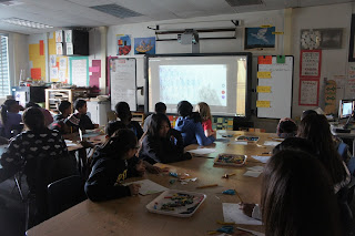
Before letting them at it, I review the process (following the breakdown above) and talk about how before they draw anything, they need to have a collaborative conversation with their partner. They need to develop a plan before doing anything else. I remind them that they need to do their best to keep the noise level at 2- partner talk, so everyone can focus. I give them about 15 minutes to work and then share a video tutorial I did, so they can see how the stop motion app and process will work.


When I share the tutorial, most kids are about halfway done, but some are almost ready to roll. The tutorial covers the stop motion app basics, opening, taking photos, making very small movements in between shots (SO important), taking a minimum of 20 photos, recording sound, titling, and saving to the ipad camera roll so I can upload them to my computer.

Sharing my tutorial. "Mr. Masse, that guy sounds a lot like you."

the tutorial.


I have 3 stop motion stations set up around the room for them to use. Each station has it's own, um, personality:)


If students are ready to shoot and do not want to wait for a station to become available, they may use the edge of a table to shoot down onto the floor.

When the teams finish taking pictures, deleting any frames that have issues, they go outside to record their soundtrack/voice over. A number of teams haven't been able to finish in the scheduled 80 minute session, but so many of them have stayed during recess, lunch, or after school in order to wrap it up. The enthusiasm is genuine.

So, when all is said and done, their will be over 90 stop motion shorts done by the end of the day tomorrow! Whew! 


Here are some of the out of this world shorts being made by our Zamo  kids this week.


And now onto clay week! (That won't be busy at all;)

Tuesday, April 26, 2016

city of dreams... and solid figures!

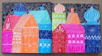
This week the 2nd graders are experimenting with texture as a way to create and transfer images. We are looking at the wonderfully vibrant work of Lisa Congdon. I have shared Lisa's work with students in the past. It is always a treat to introduce students to her refreshing take on the visual world.

For this project, we are looking at a spread in one of her sketchbooks that she titled "City of Dreams". This drawing works so well with the 2nd grade math curriculum because at this point they are learning about solid figures. When introducing this drawing, I ask the kids what solid figures make up the buildings- rectangular & triangular prisms. We also steer towards what makes these buildings look 3d- Lisa uses light and dark and she shows 2 faces of the buildings.

Lisa Congdon's "City of Dreams"


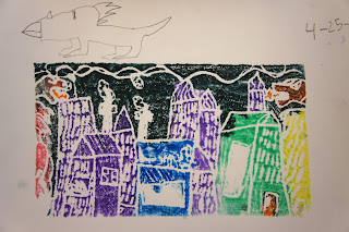
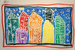
 We are scratching into styrofoam as we draw the elements of our cities. This changes the texture of the styrofoam and is what makes the lines show up in the final print. We build a couple buildings together and then the students need to add at least 3 more. When the shapes are all in, we then add patterns to the faces- trying to use more lines on one side, so the buildings will appear to have light and dark faces.


When coloring the solid figures, we are trying to use one color per building, to make the light and dark line effect more apparent.


When the kids finish printing, they are to reflect on the concepts and process with a written reflection. Vocabulary is posted in the room and they make talk to a neighbor if they are unsure how to answer a question. 


Saturday, April 23, 2016

success with Santos.


This week some of my 3rd grade classes have been checking out the work of  Santos Leonel Orellana Paz. He goes by Santos. I share that he is originally from Honduras, he found his way out to San Diego County via the bio-tech industry after earning a degree in chemistry.

He believes that the most important thing for the success of children is education. This belief led to his creating the Alfabetismo collection of paintings. A series of 26 paintings that focused on one letter of the alphabet at a time. The students and I went through a number of these, looking to find the letter that was camouflaged in an abstract network of lines and color fields in the background.


This lesson was their introduction to watercolor painting technique this year. Their painting would serve as the background to a line drawing of a word that they felt was important to the success of a child in life. We talked about how this was different to Santos' series because they would be using a whole word instead of a single letter in their image. 

When we started painting, I modeled using more or less water to create different color values and then they created their color fields.


The next part of the process was to brainstorm a short list of things they felt were important to their success. They then sketched out a couple concepts- just the word first and then they added other lines and details to hide the word a bit more and to flesh out their compositions. 


When they had a sketch they were satisfied with, they drew it out lightly with black crayon over top of their painting, added supporting lines, and made those lines bold and strong to emphasize them from the background. (With this step, you want to make sure there is enough time between finishing the painted background. If the paper is too wet, it can tear or the crayon won't apply as cleanly. A hair dryer could be used for those pieces.)


The final part of the project was to explain WHY they chose that particular word. Why did they think that particular things was important. 


"Sleep" is important because it is needed for your health.


"Confidence" is important because you need to have good thoughts
about yourself to do good things.

Santos is actually opening a new gallery of his artwork in La Jolla this weekend. If any readers are local, you should swing by to check out his work!

Wednesday, April 20, 2016

trying out texture!

The kinders have been experimenting with texture in their most recent rotation with me. We met before spring break and did one project and then this week (after a 3 week break) we continued investigating what texture is and how you can use it in art.

The first lesson was based on a travel poster series by the Filipino group of Team Manila. Over 1/3 of our students have Filipino ties, so it's always great to share contemporary art from there with them. We looked at one poster in particular and talked about the patterns found on sailboats called vintas in the Philippines. We then got into texture and students volunteered to touch items around the room and described how they felt.


We then drew out the basics of the composition together on styrofoam plates, so we could turn the image into a colorful relief print. We added lines to the sail and students added patterns of their choosing to them. After demonstrating how to hold the marker when coloring on styrofoam, the kids filled their scenes with water soluble marker colors.

Everyone then transferred their image onto a piece of smooth watercolor paper with my help to wet the paper and to hold the paper still as they rubbed.


This week, we have been looking at an illustration by super rad LA based artist, illustrator, and animation designer Kevin Dart. We started by looking at one of his image and spending almost 10 minutes identifying things, shapes, and colors in the landscape. As we identified items, I wrote them on the board next to the image, so the kids could see the wealth of vocabulary present in the image. We used this image as inspiration for a landscape drawing. Instead of using polka dot patterns for the centers of the flowers, we used plastic texture plates to add patterns in those spots. I also encouraged students to add little lines to their field to give that area a sense of grass like texture.


And one last thing! Did a test today using students drawings as backdrops for stop motion shorts. The flying bee was done first against a green screen, took a photo of a student drawing, and then combined the two. My hope is to do much more of this- having kids make their drawings come alive, as a choice center at the end of lessons. We'll see how it shakes out this year:)