Wednesday, June 29, 2011

new lands with lindsay.

Lindsay Denehy is a designer living down in Baton Rouge, Louisiana. I met lindsay years ago while both of us were drawing outside the lines at LSU. I recently rediscovered some of her work online.

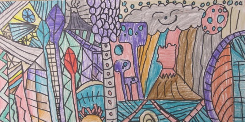
I enjoy how she abstracts and flattens natural forms in landscape images. You can see the influence of Dr. Seuss and Hundertwasser, but she definitely has a created a visual vocabulary that is all her own.
She has a great eye for composition and space. There is a great balance of pattern and open space in many of her images. She understands that their often needs to be some "breathing space" in a composition, so the viewer isn't overwhelmed when taking an image in.

I thought that her work would make for an interesting investigation into 3d space in art for my last go round with the 3rd graders this year.  When I shared her work with them I emphasized that even though an image is abstract it can still have 3d depth. It can still have implied volume in the shapes. Recalling a couple other projects this year, the students were able to identify 3d space in Lindsay's landscapes through overlapping and size change. They were also able to see how some shapes looked 3d because of the tints of colors used to show that one side of the object was receiving more light than the other.

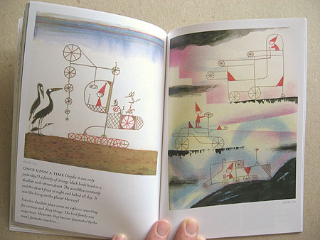
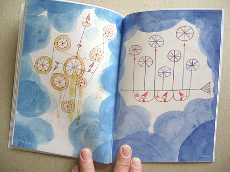
The main images we viewed were a large mural and a small computer generated drawing.


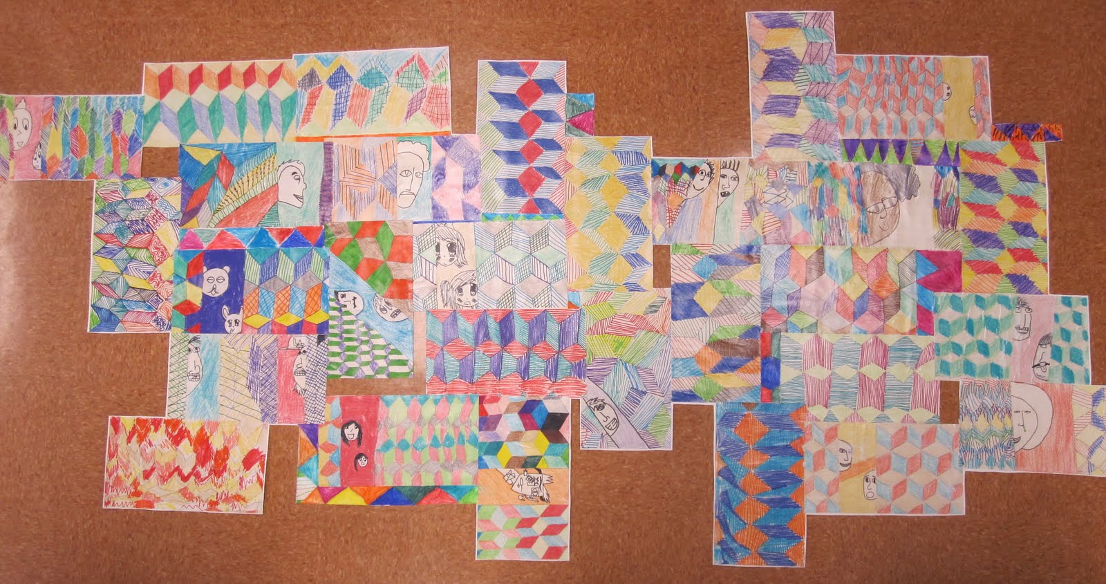
After modeling how you can be inspired by an image and not copy it, I let the classes try it out for themselves. There were many interesting interpretations of Lindsay's style and visual vocabulary. Some stayed closer to her original images than others, but nobody copied one of hers exactly, which I was very excited about.

After drawing out their compostions in pencils, students traced their contour lines with black markers. Then they added color to the drawings with crayons. I emphasized and modeled  the use of tints to add visual variety and to make some, if not all of the shapes look 3d.

The classes were unable to finish the project in one hour, so it carried over into the next lesson. Most students need 2 full hours to complete the activity. Those that finished early were tasked with creating another abstract landscape, either by themselves on a smaller scale, or with a partner on a larger scale.

I really love the way so many of these turned out. 


Monday, June 27, 2011

a funky ride with rob d.

I have wanted to revisit the work of Rob Dunlavey with another grade since doing a project based on his work with 2nd graders earlier in the year. I finally actually did.

I gave the kindergarten students a peek into his imaginary world of pointy people and crystal cities today. They were immediately engaged by these inventive people and places. Rob creates these worlds with a lot of geometric shapes and patterns. There is a rich complexity to many of the buildings he makes, but he uses  a simple vocabulary of shape and line that even young kids can understand and experiment with.

After viewing some people, places, and machines, the kids and I got started making some of our own. We combined a couple images of vehicles Rob did with landscapes that used geometric shapes that were inspired by his crystal city drawings.

There was a fair bit of direct instruction in the vehicle drawing, but I did give students room for originality in shape choice. When we got to the landscape portion, I modeled some possibilities, but the students were free to include whatever they wished as long as it was small and used geometric shapes.

The landscape portion was a good re-emphasis on creating 3d space in art. We made things small so they looked far away. We the same thing with the Justion Skeesuck beach scenes last week.

When students finished drawing, they traced their lines and then added color "neatly and carefully" to their images.


Friday, June 24, 2011

skeesuck san diego sun.

A local San Diego designer, Justin Skeesuck, made this image almost a year ago. So calm and peaceful. The simplicity of the color and composition works wonders. I have kept returning to it time and time again over this past year.

Perfect for a summer art lesson with kinders. We talked about Justin's image being a landscape and how it showed 3d space through value and size change. They had previously investigated space by using size change in a project based on the work of Tracy Walker.

The students got to practice cutting, gluing, and placing paper in a "sensible" place. They added simple paper shapes to create most of the landscape. The students drew out the lifeguard tower and lifeguard at the end. They could choose multiple colors in the foreground as long as they were dark or bold to contrast against the lighter background colors.


I'd like to try this as all collage sometime.

Thanks for the inspiration, Justin!

Wednesday, June 22, 2011

making monkey bars.

3 more weeks of instruction with my kinders. What might I do to get them engaged (quietly:) in my room for an hour?

Aha... the monkey bars. I loved the monkey bars as a kid, still do as an adult! Then I needed to find an artist who had used these fun filled cages of steel and plastic as the subject of an artwork. Hello, Stephen Schildbach. Stephen is a web designer, illustrator, and painter living up in Seattle, Washington. The paintings that he makes often combine different layers or windows of information for the viewer to put together. I liked this aspect of his work because I do something similar in my personal drawings. His color palette is subdued. It reminds me of looking at aged postcards. Something about the faded quality always draws me in.

When I shared work from his website with the kids I pointed out his use of different frames and windows in the same image. I talked about how tv shows and cartoons often use this technique to show that people are not in the same room, but in different places. A couple students mentioned that they had seen it when characters make phone calls on tv. Great example!


I then showed the students his jungle gym painting. We talked about the multiple frames, his use of pattern, and his use of outlines to make details of the different "characters" more visible. 
The kinders then rolled up their sleeves and got to making their own monkey bars composition.
1.  A solid 9x12 color sheet of paper as the base
2.  A second piece that they cut in half with a type of line of their choosing- straight, wavy, zig-zag, etc.
3.  Glue 2nd sheet on
4.  On one half, draw a set of monkey bars- they can add any features they want
5.  Draw a person on the other half- it can be a them, a family member, or a friend. I model drawing a person standing or running. In the air or on the ground. I also model using double lines on body parts, so the person doesn't look like a stick figure.
6.  Add some sort of pattern to the drawing, using any shape.
7. Add color and outline parts of each section of the composition- monkey bars, person, and pattern.

The kinders definitely had fun with this and there were many unique playgrounds created in each of the classes.


Tuesday, June 21, 2011

2011 Celebration of Art

Last Thursday Zamorano had it's 24th annual student art exhibit. I think they have gotten better and better each year. Our art team put the exhibit together in one hectic week. Our classroom teachers hosted art activities all over campus the night of the main event as well. A big thanks to everyone who supported the event in some way.

The visual arts are indeed alive and kicking at our site. Our students are amazing artists and our teachers are  wonderful facilitators.

ZAMO! CREATE!

The work below is just a small sampling of the work created by our students with the guidance of our art team- myself, Miss Kathi, Miss Danielle, Mr. Eddie, Ms. Pothier, and Ms. Vance.


Wednesday, June 8, 2011

me and barry mcgee.

I have been digging Barry McGee's work for some time. He started out as a graffiti artist (aka Twist), gained some San Francisco recognition, then went to college, and continued to travel and develop his mix of line, characters, and assemblages. He has been able to bring his "street style" to museums and galleries around the world. I love the way he assembles many drawings and/or patterns to create one of a kind installations. I also enjoy the often sad sack looking dudes that inhabit many of his paintings and drawings. I find the juxtaposition between those guys and his repetition of line, color, and shape quite enjoyable and dare I say, intriguing.


So, the 5th graders got one more dose of street art in their art curriculum this year:)

The students thought those dudes were pretty interesting. And pretty weird. I showed them a number of his more current pieces and emphasized how Barry creates a lot of unity in his work through repetition.


I did this project with two of my 5th grade classes. Each of the classes created a large collaborative drawing based on Barry's use of pattern and portraits. Each of the students was responsible for at least a pattern in the final design. If they wanted to include a portrait into their drawing I encouraged them to do so.

One class did their drawings on all white paper. The other did their patterns on black paper and portraits on white. I wanted the 2 final pieces to contrast in terms of base value. As students finished up with their drawings they brushed multi-media varnish on the back and then placed them on a large canvas.

Once the assembled drawings were totally dry I went in with scissors and and an x-acto blade and removed the extra canvas around and in between the pieces. I brushed a clear varnish over them as well. The clear varnish removed some of the color intensity on the black paper one. I should have tested it on a small piece before jumping in. Lesson learned...

Overall though, I think they came out pretty interesting. We are hanging our big student show this week and next, so I will have to post a couple pics of these in "exhibition context".