Tuesday, May 29, 2012

beep beep!

Today the 2nd graders and I went old school.  A while back I had pinned a couple images that Dutch illustrator and animator David de Rooij used to create a fictional museum exhibit. That concept alone was pretty cool and seeing the images he chose for the non-exhibit cast them in a whole different light.


I had them look at these background stills from the old Road Runner cartoons from Looney Tunes. We talked about a lot of things, such as why the coyote never caught the dang bird and who is faster? sonic or the road runner?

We also talked about the desert setting of the cartoon landscape and how the cartoonists used light and shadow to make the settings somewhat believable.


Each class drew a different still or combination of stills to create a landscape that showed depth and volume through color, detail, and size. The students did a great job with the complexity of the source material and even though they drew the same thing there was a lot of variety in their work due to hand pressure and how fast or slow they made the different lines.


Monday, May 21, 2012

old school little people.

Last week the kinders visited Sesame Street, this week they met some Little People. Both lessons were trips down memory lane for me and both were inspired by contemporary artists revisiting these pieces of the past.

Meredith Steele is an artist and educator working up in the Bay area and she does many portraits. The color palette of these paintings and the rough finish/brushwork of many of them draws me in. One portrait series she has done focuses on the old school Fisher Price Little People that I grew up with.


Since the kids did the Sesame Street abstractions last week I thought it would be interesting for them to see another artist's approach to those characters. Where Thom Pastrano rearranged and flattened the characters, Meredith used light and dark, as well as curved lines and shapes to make them look more real and 3d.

I pointed out the different ways Meredith made these Little People look real in a couple examples of her paintings. 

The students and I drew out the basic shapes together, starting with the head shape and then using a couple cylinders for the body. I showed them a number of ways to make facial expressions and hairstyles and they chose which way to go in their drawings. 

I modeled pressing hard and soft to create shadow and light in a drawing and then the kids went for it. I was pleasantly surprised at the sensitivity to touch and pressure that many of the students have developed over the course of the year.

The kids came up with a wide variety of Little People. it would be cool to make small clay or wood sculptures based on these drawings...


Thanks for the inspiration Meredith!

Here's a few more from today!


Thursday, May 17, 2012

mmm... pop!

This week I did a project with the 3rd graders that is inspired by a collage by artist Lisa Congdon.

I started by sharing this image with the kids and talked about how the background pattern contrasts against the radial design in the middle. It does so by using lots of curves and having lots of detail compared with the straight lines and simplicity of the foreground design.

To make it a bit different for the kids, instead of triangles making up the central design, they used cut paper popsicles:) I show them an example of one of the popsicles and the kids told me that it didn't look flat because of the white and black along the edges that show light and shadow. This is something we have repeatedly worked with all year, so I'm glad they identified it so quickly.

I then explained that we would make a stencil out of paper, so that we may spray paint the background pattern onto another piece of paper. The kids, um, LOVED this part. The background patterns really create a lot of variety in the classes' designs. And really, it's a step that is a "can't not succeed" part. No matter what they do, the patterns come out pretty darn cool.

They constructed their pops out of paper, then they did their background patterns, and then they glued them all together.  I gave students the option of using leftover stencil paper to add symmetrical details to their designs.

Each of the classes worked with a different variation of an analogous color scheme.

As an added bonus (and behavior/creativity incentive) A couple of projects from each class are going to be in an exhibit at a local pop shop called Viva Pops. This will be the 2nd annual Zamorano student exhibit at the store. We'll have a reception for family and friends in a few weeks:)

Great job kids and thanks to Lisa Congdon for the project inspiration!


Tuesday, May 15, 2012

a visit to the street. part 2.

So, I decided to mix it up with the kinders today. The project was still inspired by Thom Pastrano's series of abstract Sesame Street character posters, but we did images based on a couple different characters than the ones in his series... so far.

Today we looked at Oscar and Big Bird. I showed the kids photos of the puppets and we talked about how an artist doesn't always have to make something look like it really does. We compared Thom's posters to the real deal characters and then we got started making our own.

I'm partial to the Big Bird ones, but Oscar came out cool too. Although I think he reads too much as Frankenstein when the black shape is at the top.

Great job cutting and gluing, kinder kids!


Monday, May 14, 2012

visit to the street.

As in Sesame Street.

Designer Thom Pastrano has done a fantastic series of abstract images based on classic characters from one of, if not, the best children's show of all time. I LOVE these. I thought it would be a kick to recreate a couple of these with my kinders this week. I thought kids would also get a kick out of it.

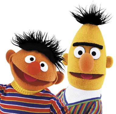
Funny thing though. When I showed the classes the image below, not many kids knew who the characters were.

I was stunned, and to be honest a little sad that they could not recognize these two cool guys:( More kids knew who Ernie was, but Burt, not so much. We then looked at them and identified shapes and patterns.

After sharing the above photo, I told the class an artist had done pictures of Burt and Ernie, but the pictures looked a lot different. He had moved things around and flattened things out to make something new and interesting.

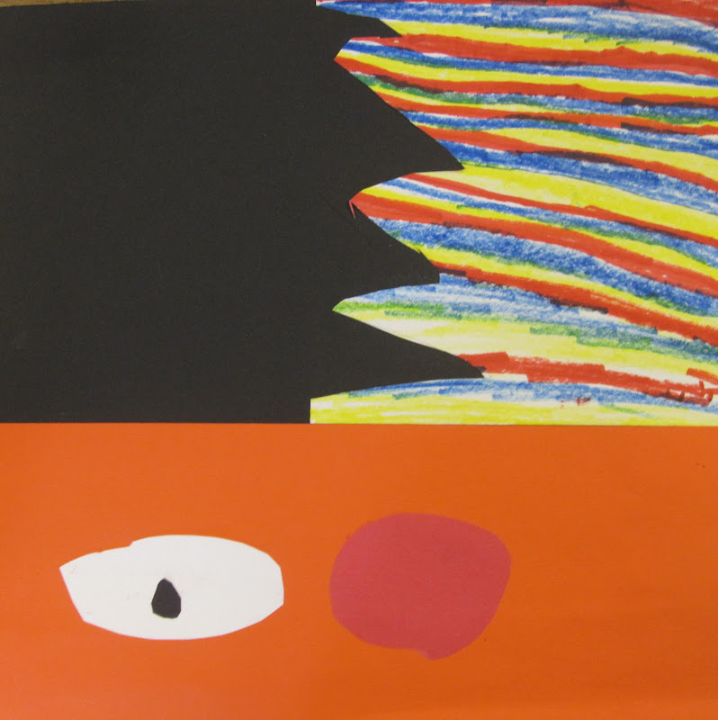
We took a few minutes to identify where the parts of Thom's images came from on the two puppets. Then we started making one or the other character. The steps were pretty simple. 

The most challenging step for the students was to cut the zigzag line for the spiky hair. I changed the rectangular format of the original images so students wouldn't have as much trouble gluing the skin color piece and shirt pattern on. It also gave kids more options as to where they wanted to place those bigger pieces.

When we did the pattern part we used primary colors for Ernie's shirt and secondary colors for Burt's. I took a little artistic license with Burt's color pattern. It's actually blue, green, and orange, not purple, green, and orange. Shhh....

Great job cutting, gluing, and pattern making kindergarteners!

And of course thank you Mr. Pastrano and Mr. Henson for the inspiration.